Previous
Shiny Happy Digital
Overview
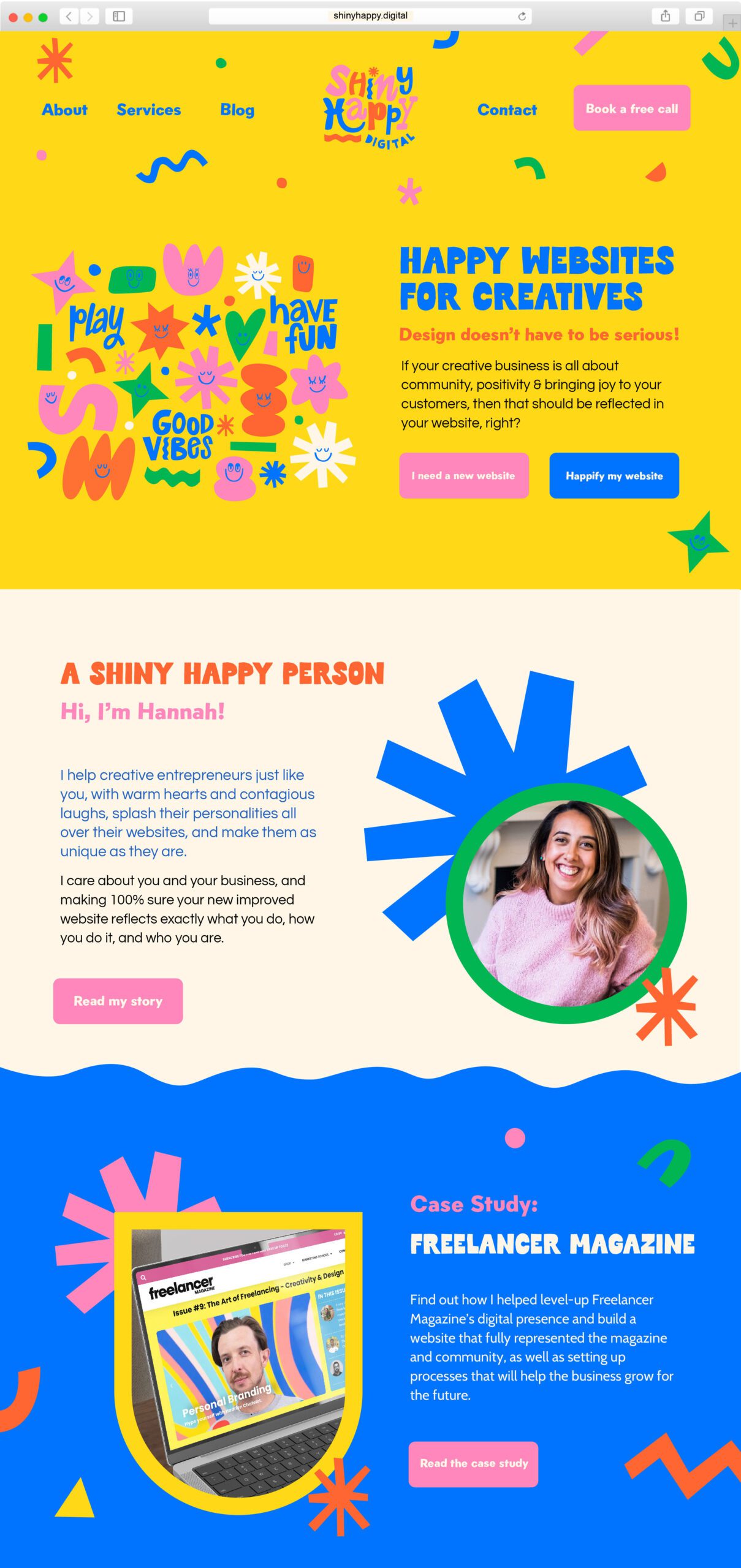
Shiny Happy Digital creates bold, fun playful websites that stand out. Hannah helps creative female entrepreneurs splash their bold personalities all over their websites and makes them as uniques as they are. Joy, play and fun are a big part of every day life so SHD incorporates this into the website designs and business.
Services
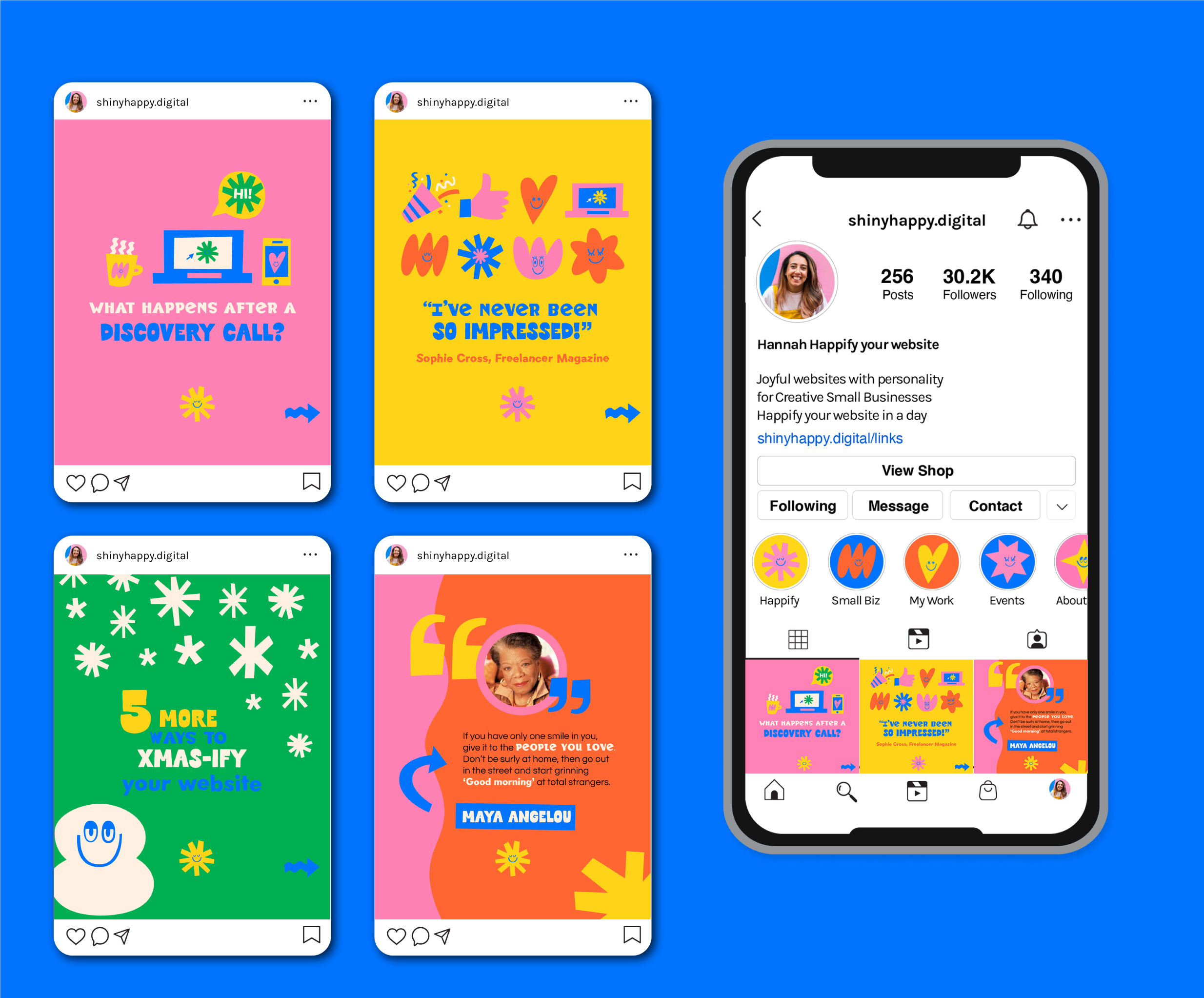
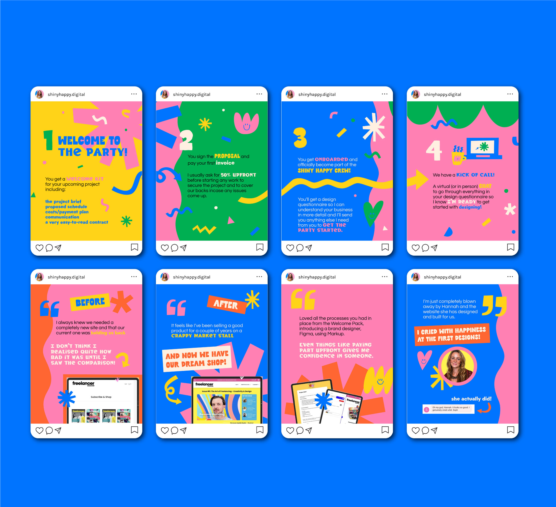
Logo & branding, illustration, brand patterns, socials, print and web design
Keywords
Playful, Fun, Happiness, Positivity, Colourful, Joy
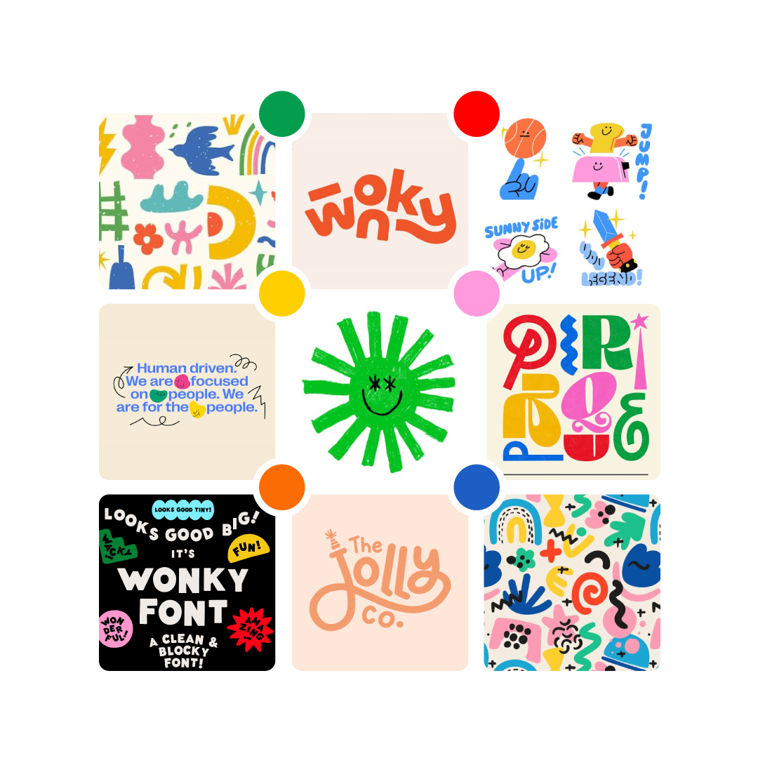
Mood board and creative direction
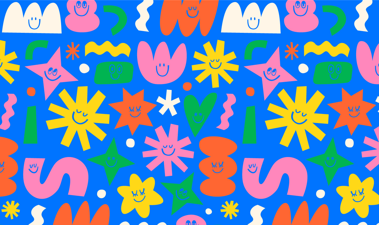
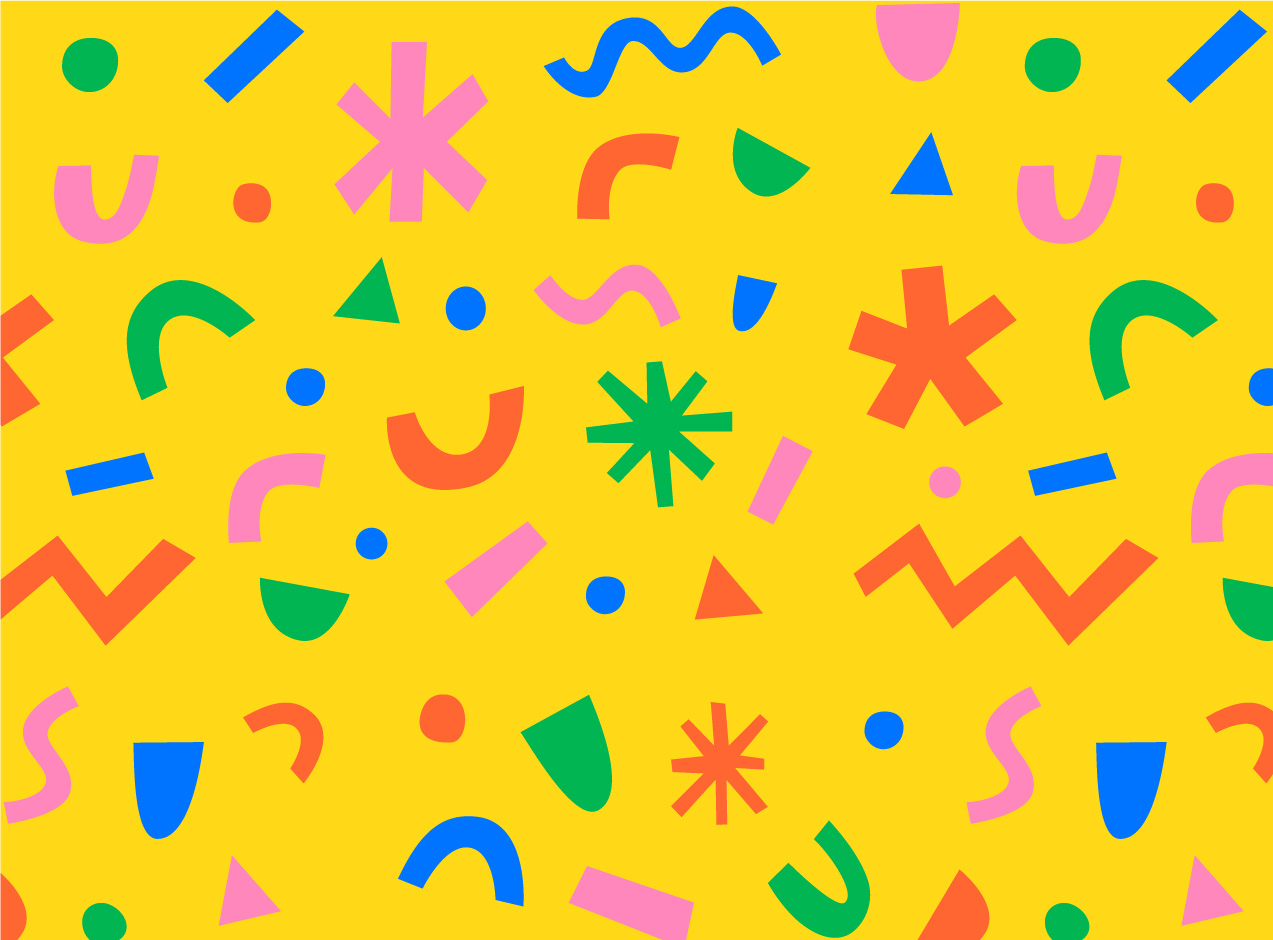
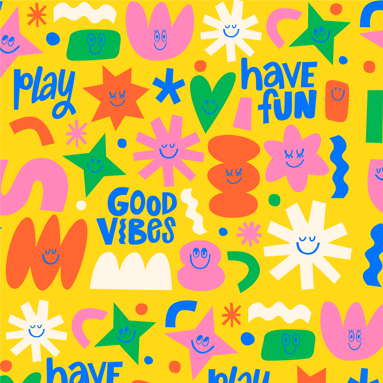
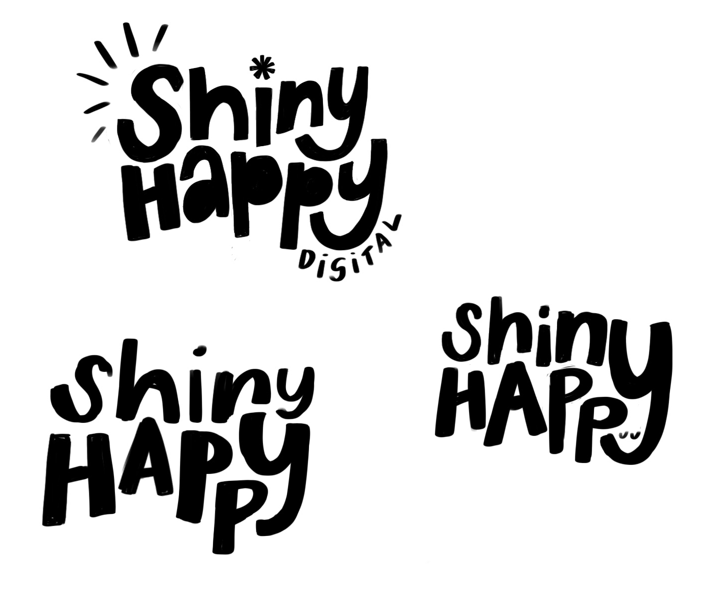
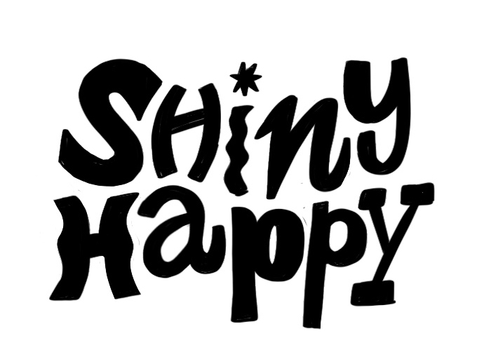
It was obvious from the start that this brand was going to be bright, loud and vibrant, with plenty of personalised colours, patterns and illustrations. This approach reflects the kind of websites that Hannah creates and attracts clients seeking bold and colourful web designs. My aim was to create a hand-lettered typographic logo that conveyed a sense of movement or a ‘smile’. I also wanted to explore using a different style for each letter within the hand-drawn logo, symbolising the unique and bold nature of each website Shiny Happy Digital creates. Early sketches below show the logo taking shape.
Primary logo and alternatives
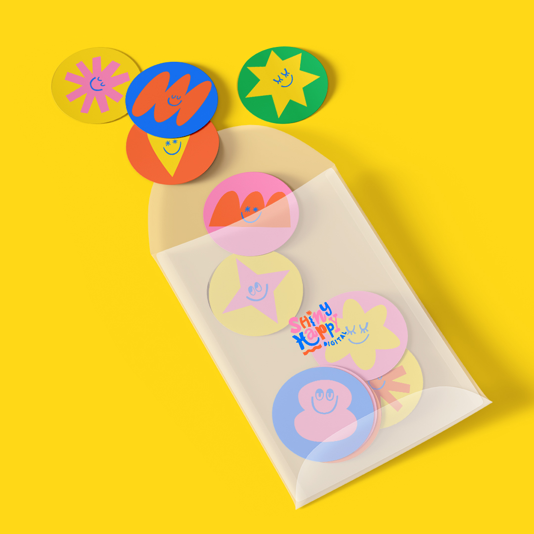
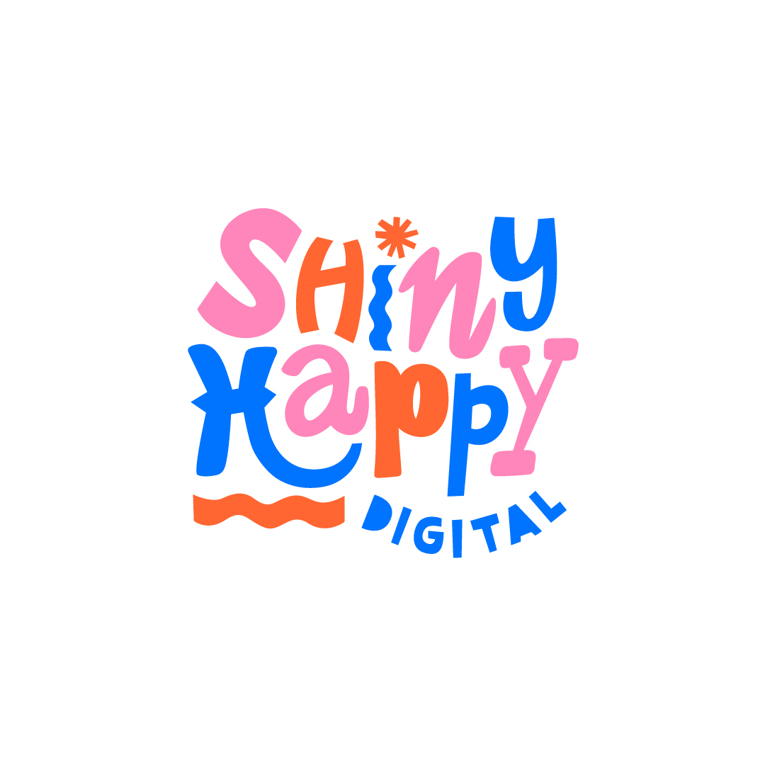
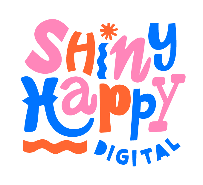
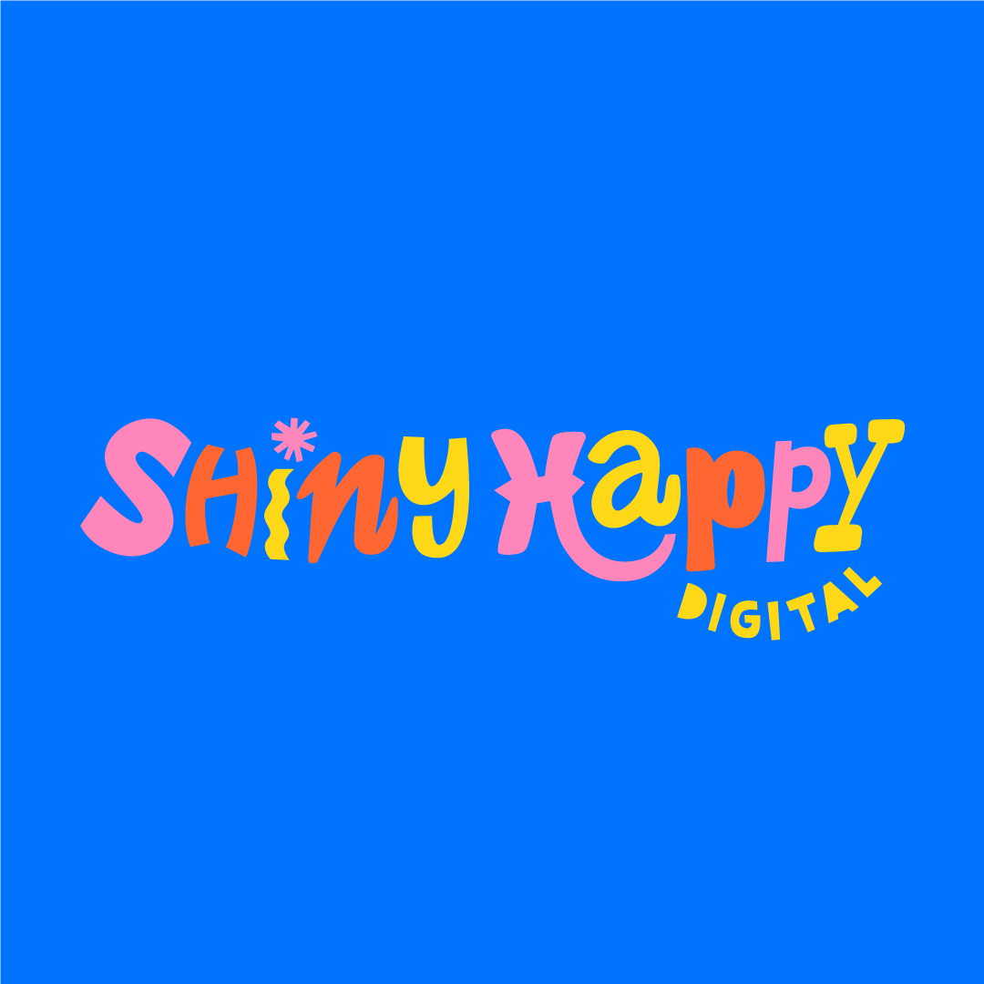
I created a fun, playful, colourful logo that reflects the work that Shiny Happy Digital creates for her clients. Each letter form for the logo is different, which mirrors the unique, playful style that Hannah uses in her web designs, each design she creates for her clients is different. The H has been designed to incorporate a sense of movement and a ‘smile’ within the logo, with the word digital mirroring this nicely and creating a balanced symmetry. The shape above the I represents a sun or star shining, this shape has been used throughout the brand. ‘Design doesn’t have to be serious’ is Shiny Happy Digital’s mantra, so above all the logo and brand has been designed to make people smile and a evoke a sense of happiness and joy. Every colour, shape and illustration has been chosen and created with this in mind.
Colour palette
The colours have been chosen specifically to be fun, vibrant and playful. Yellow and pink are the client’s favourite colours so they feature heavily throughout the brand, all other colours have been chosen to complement and contrast these. The bright, deep blue contrasts beautifully against all the colours and makes them pop. A pale off-white colour has been chosen as a background or highlight colour that is less harsh than white. This is a fun, loud, playful brand and the colours reflect that.

