Patito
Overview
Patito, meaning “baby duck” in Spanish, is a monthly subscription box designed to spark creativity and fun. Each box is packed with a variety of stationery and craft activities. Perfect for children and adults alike, Patito offers a charming and engaging way to explore new crafts every month.
Services
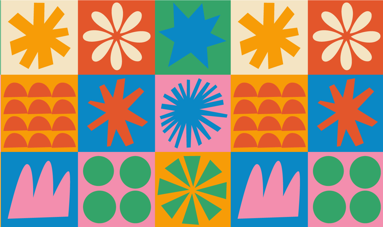
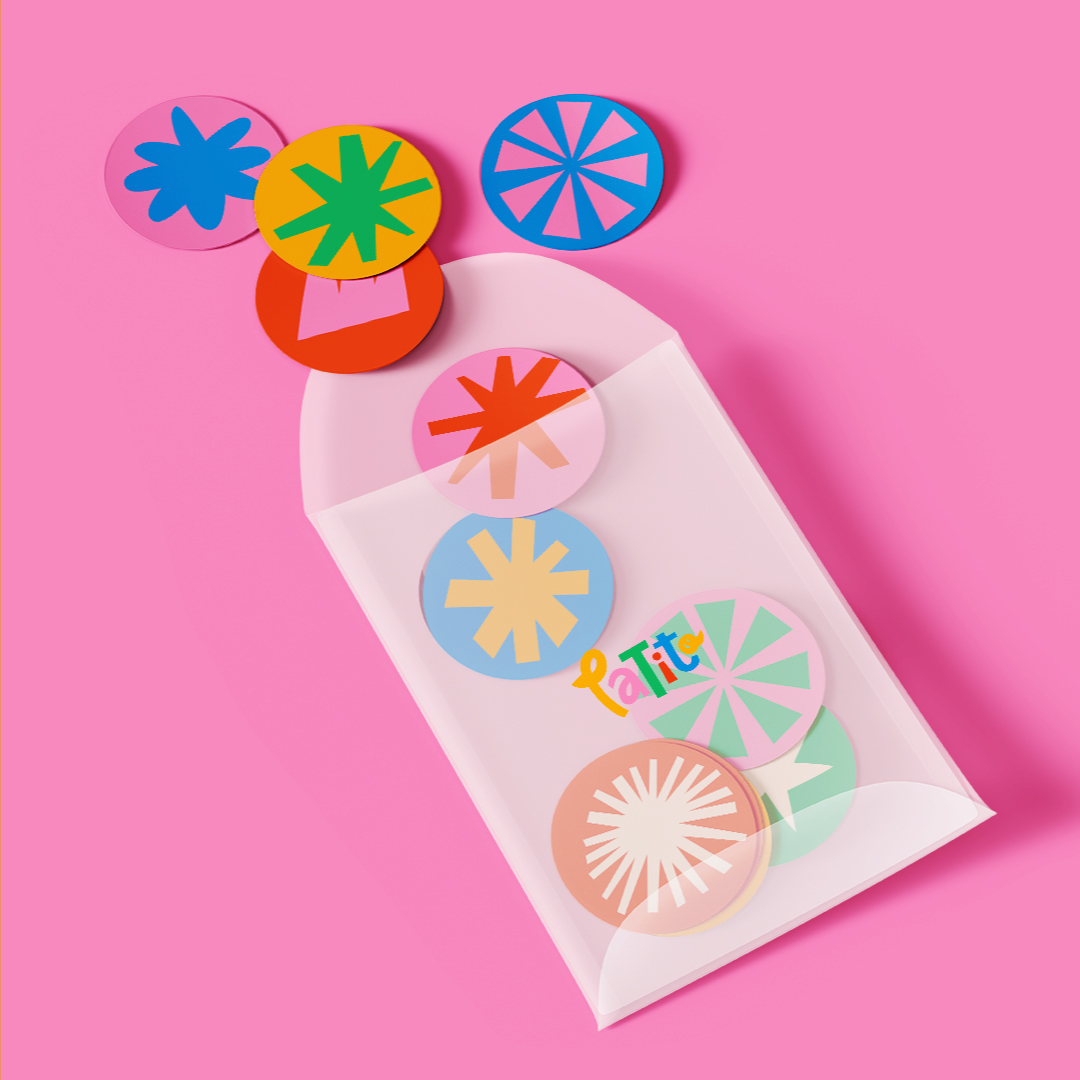
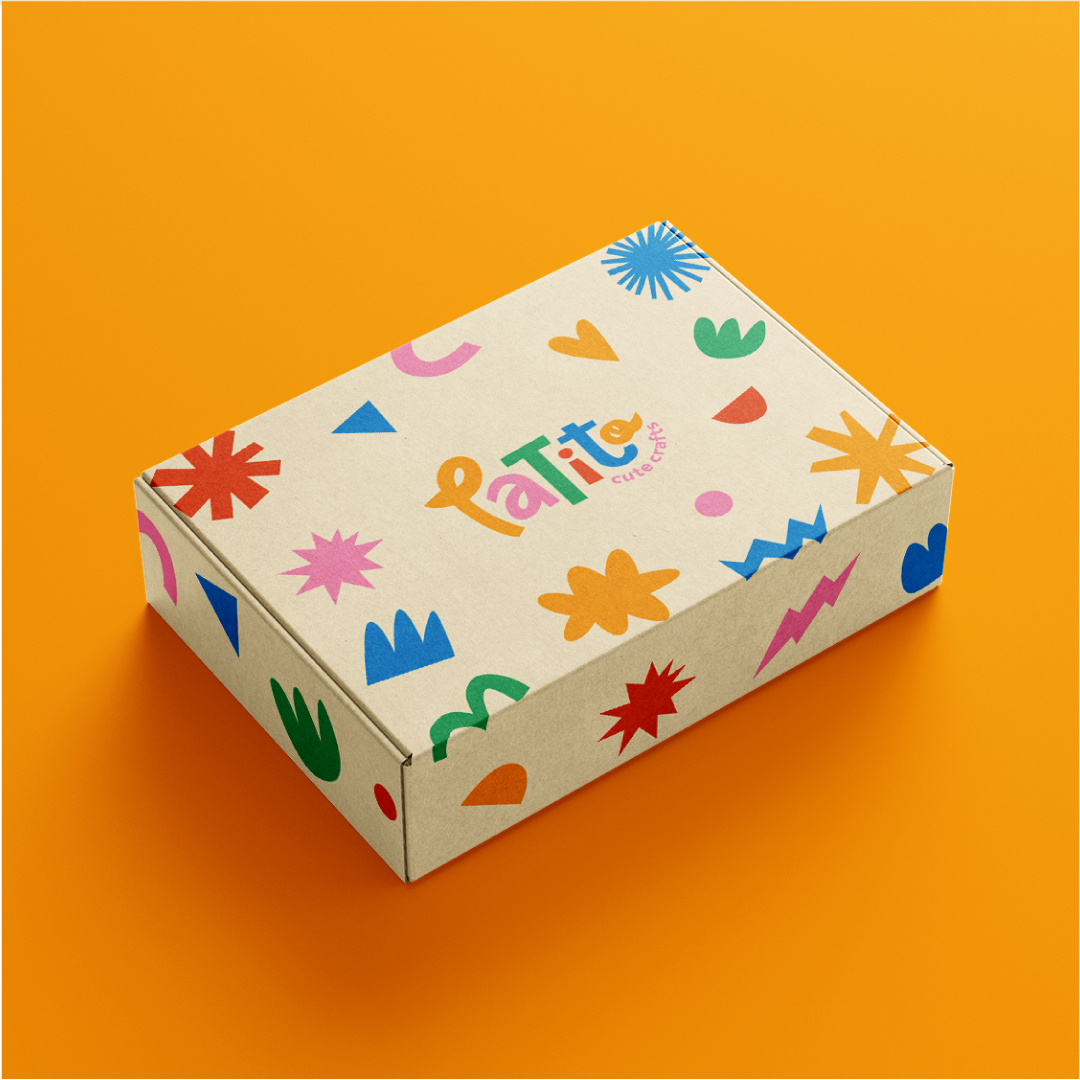
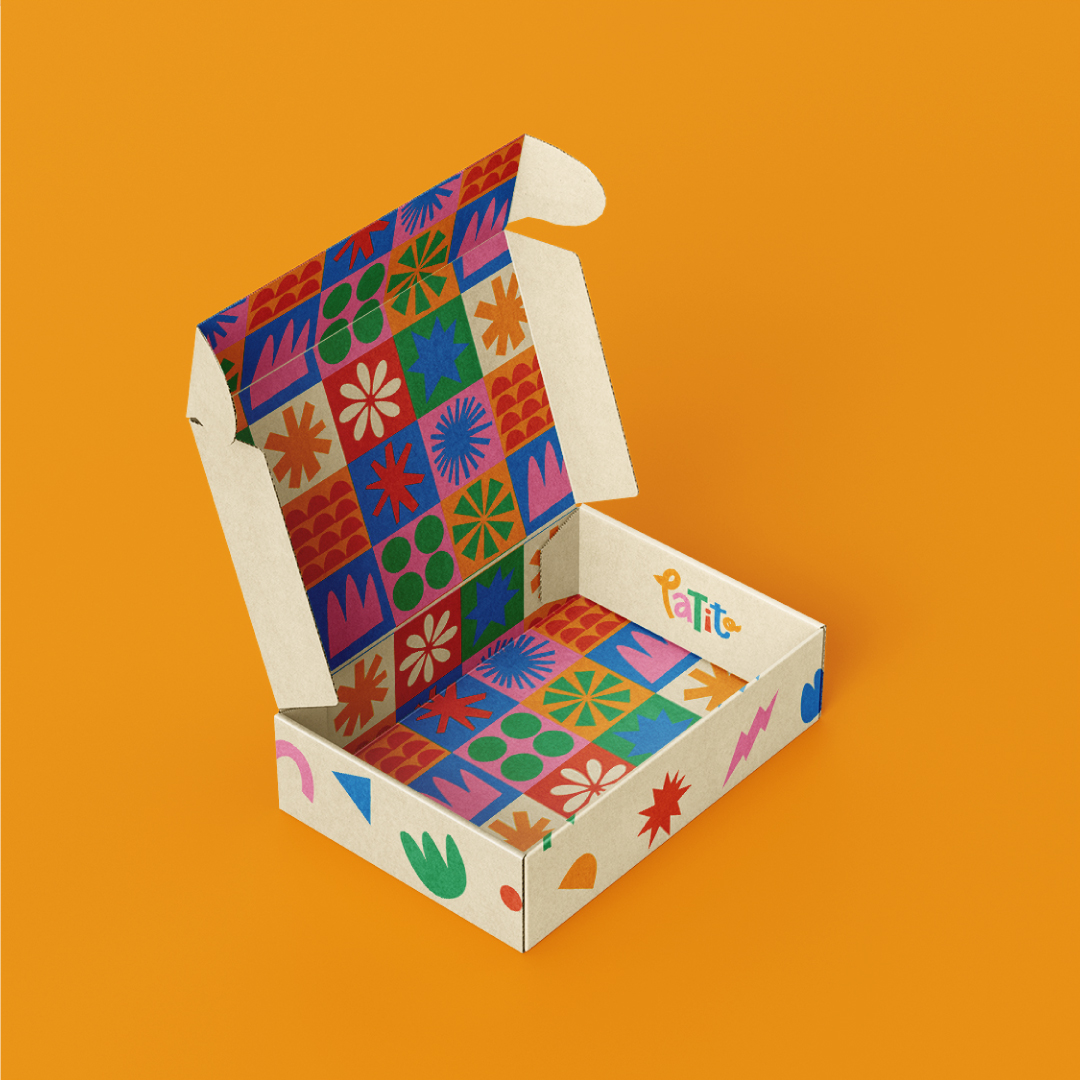
Logo & branding, illustration, brand patterns, socials, packaging design
Keywords
Creative, Fun, Play, Joy, Arts & Crafts, Cute, Duck
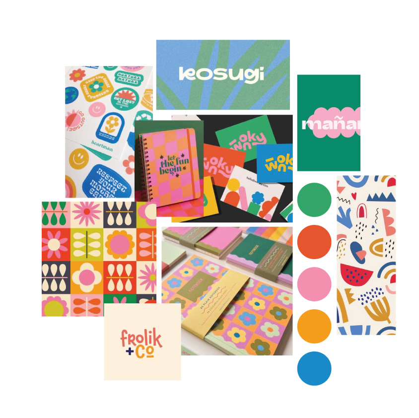
Mood board and creative direction
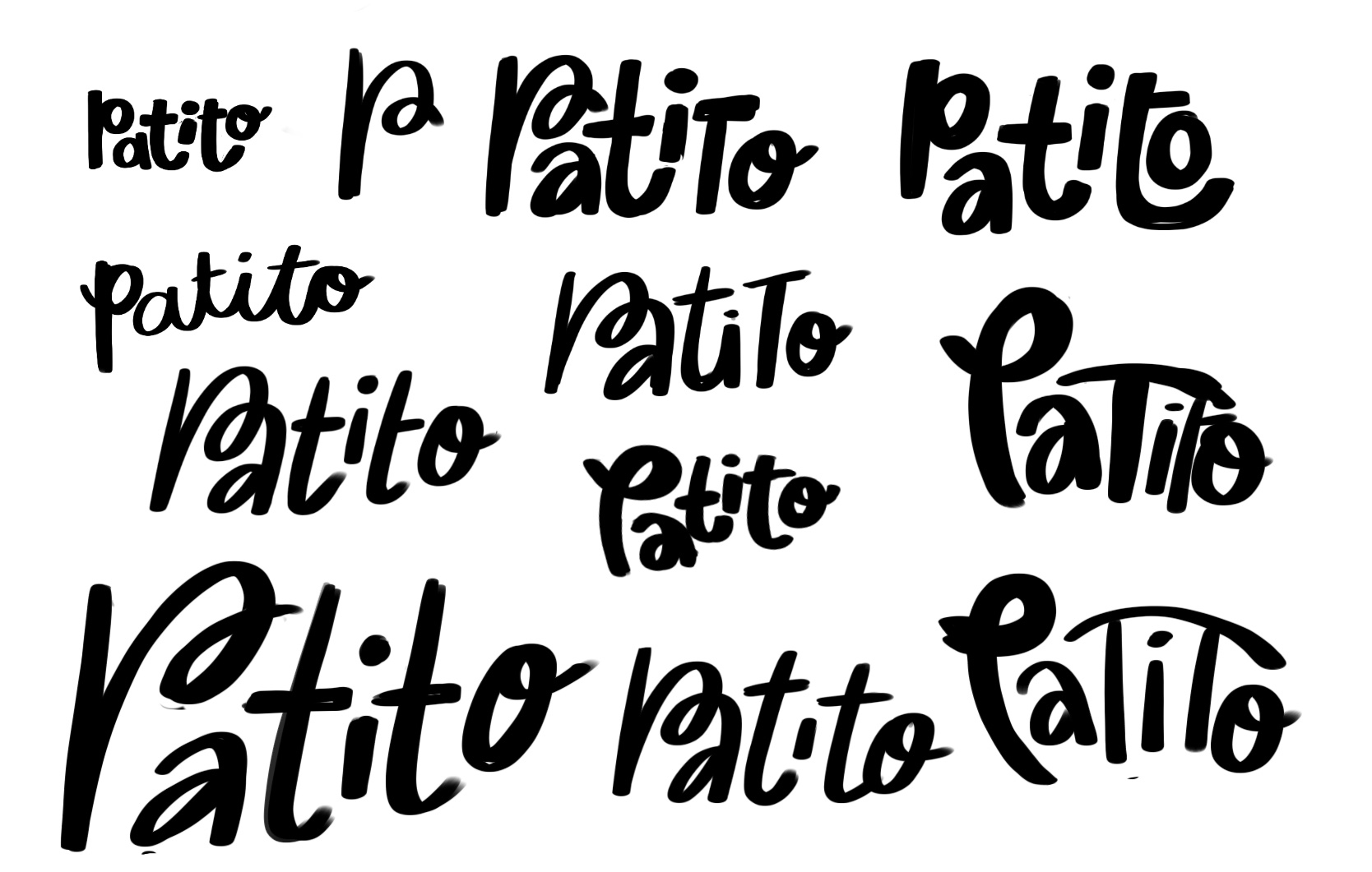
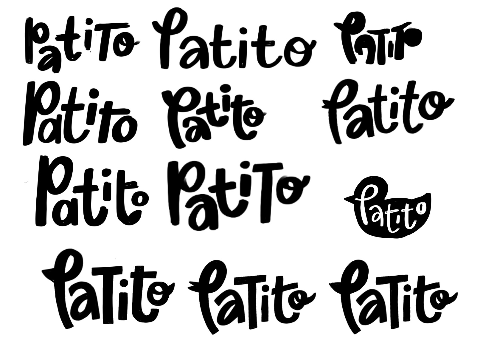
I wanted the logo and brand to be playful and creative, with lots of bold colours and shapes. Obviously with Patito meaning baby duck I wanted to incorporate this into the logo somehow, my aim was to create a quirky typographic logo with the shape of the letterforms subtly suggesting the shape of a duck. Because the subscription craft boxes deliver a monthly dose of fun and joy, the logo had to reflect this by being playful, colourful and unique. The below sketches show the logo evolving and taking shape.
Primary logo and alternatives
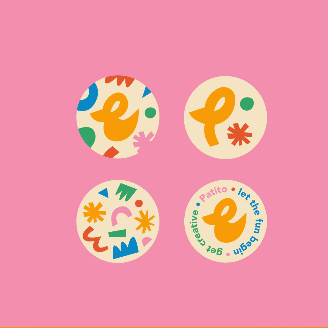
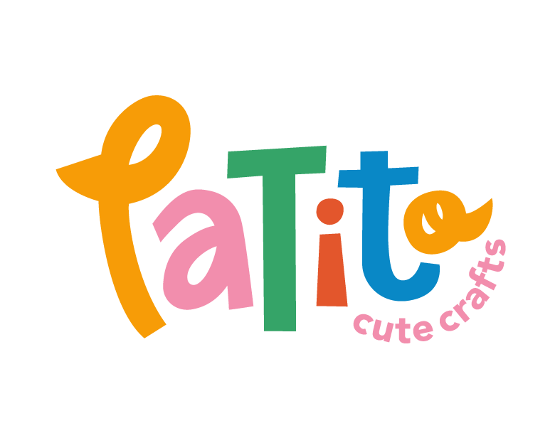
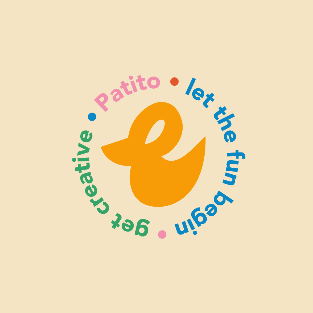
As this is a monthly crafts and stationery box, the logo to has a cut out, crafty, and imperfect feel. The overall shape of the logo mimics the shape of a duck, with the head and beak taking shape in the ‘P’ and the ‘O’ representing the tail, the rest of the letters represent the body. Overall the logo has a fun, playful feel with the tagline curving playfully around it.

Colour palette
The warm, friendly colour palette uses contrasting colours to add to the playfulness of the brand. The combination of vibrant colours captures attention and evokes a sense of joy and creativity. The colours have been chosen to reflect a fun, creative and lively brand.

