Bud & Bloom
Overview
A florist and plant shop that sells bouquets, plants, and gifts. Bud & Bloom’s mission is to add beauty to homes and workplaces but also improve mental and physical health through plants and flowers.
Services
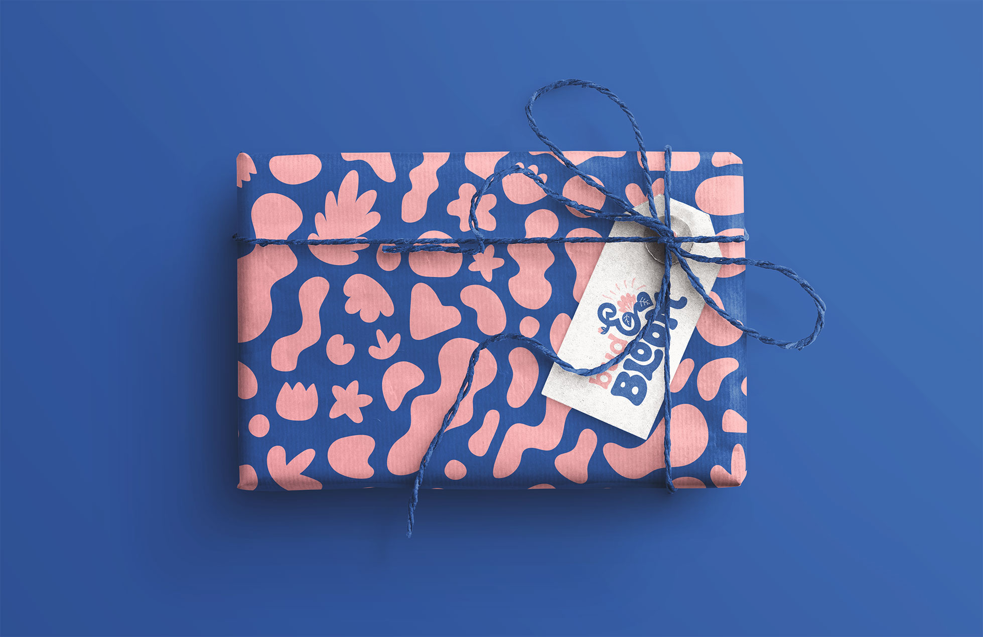
Logo & branding, illustration, brand patterns, packaging, social and web design
Keywords
Feminine, Beauty, Growth, Blossom, Calm, Nourishing, Natural
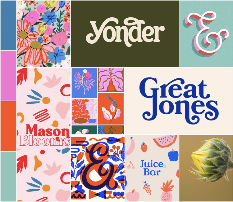
Mood board and creative direction
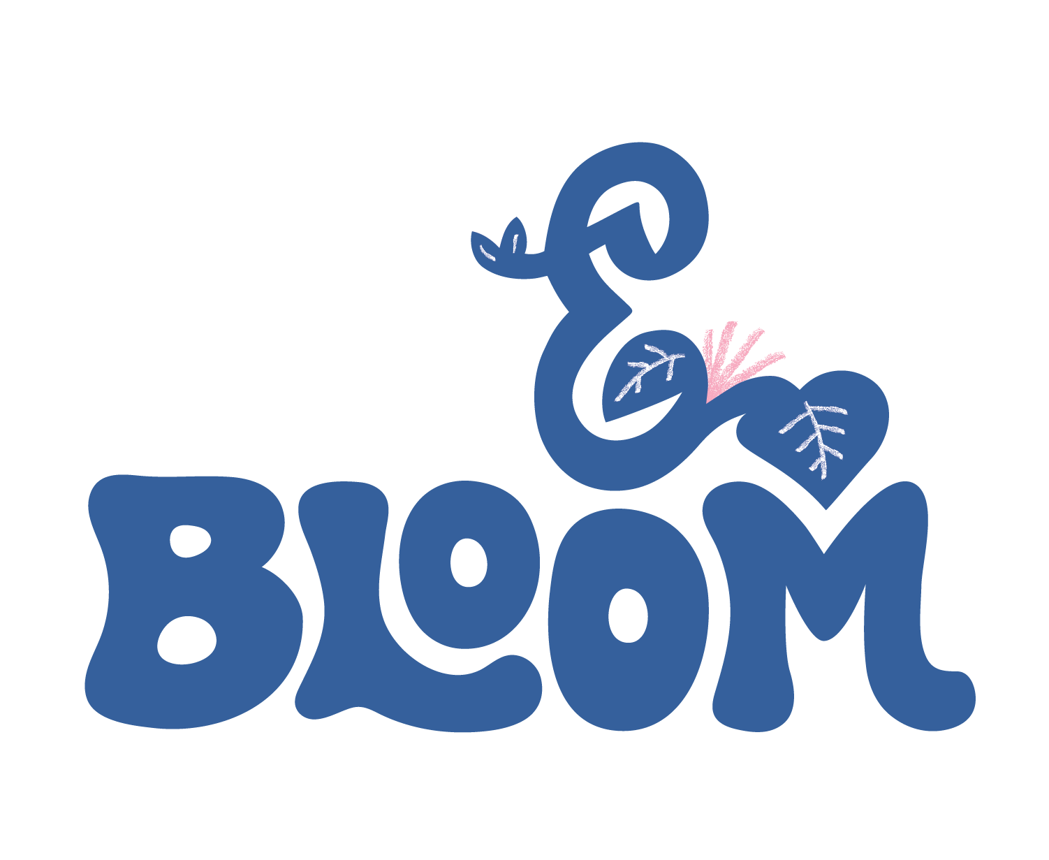
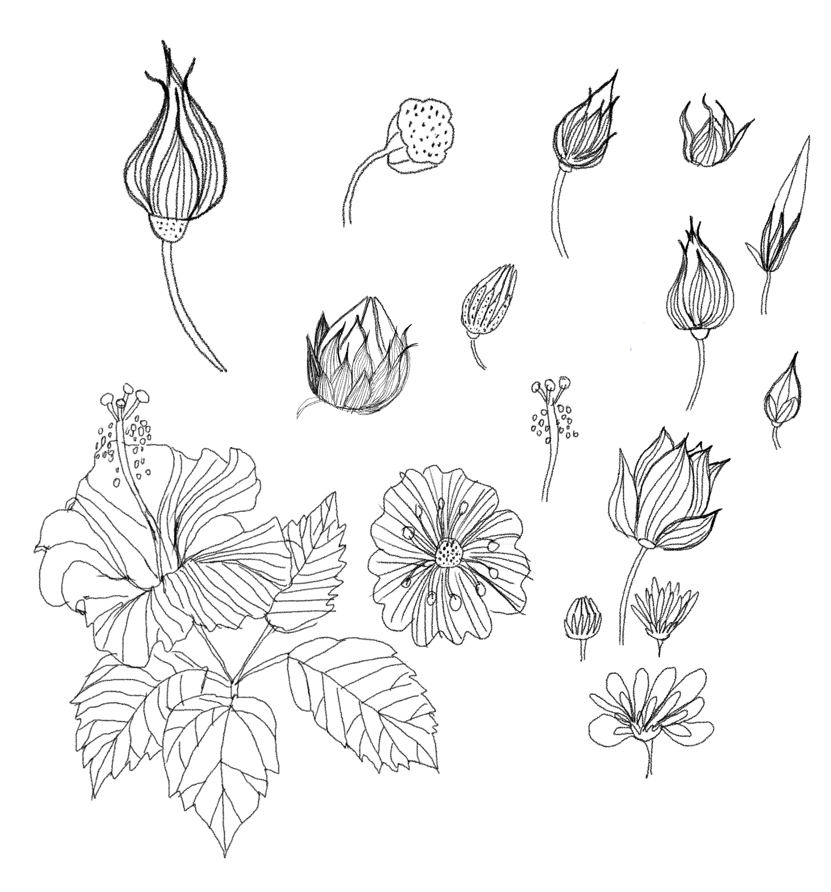
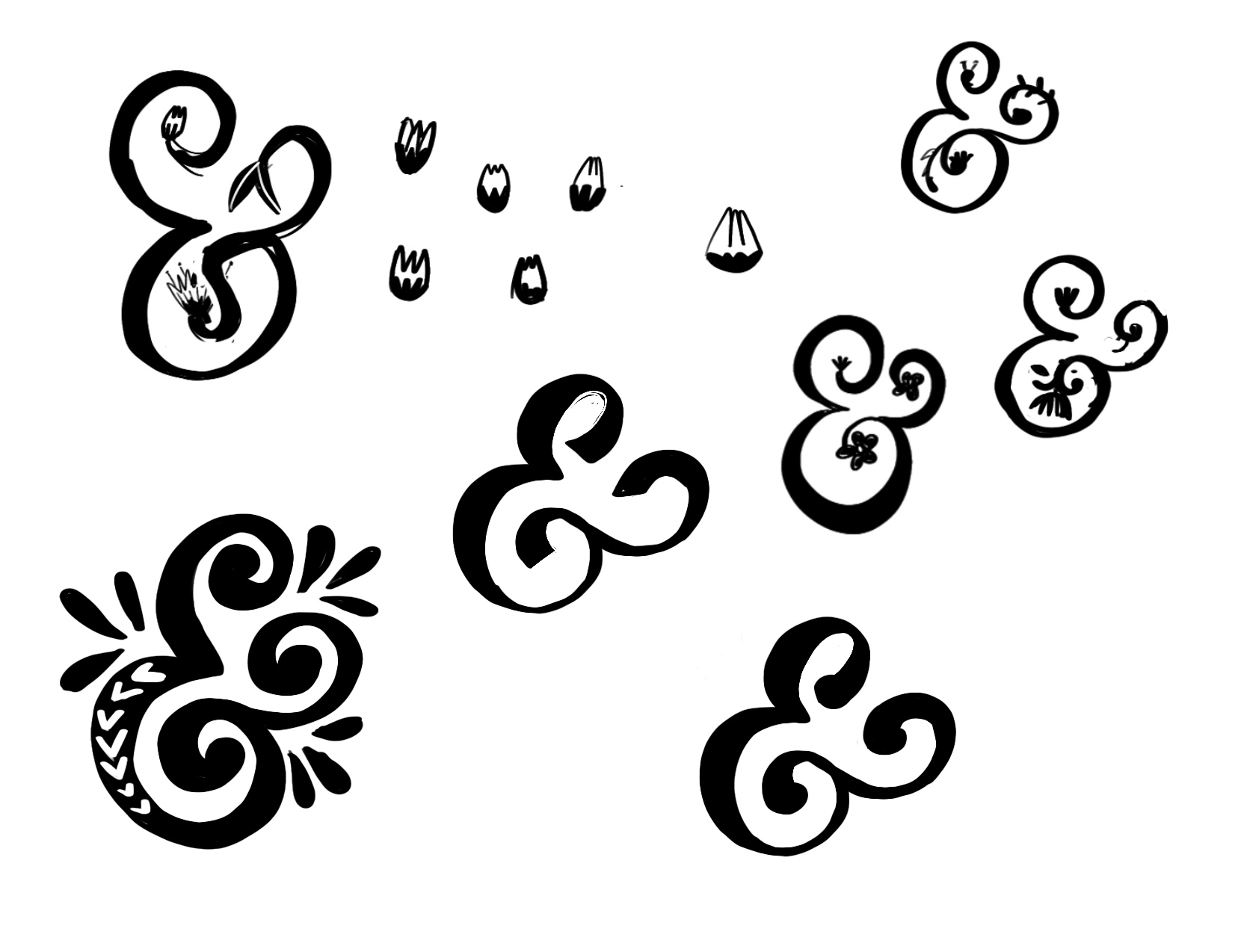
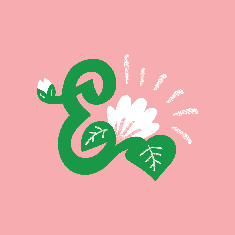
My aim was to capture a sense of growth and movement within the design, depicting the transition from a small bud to a beautiful, thriving entity. As I’ve always loved ampersands (they’re gorgeous and already give the impression of movement) I wanted to feature it prominently in the logo. Specifically, my vision was to integrate a bud and a flower into an ampersand and use that as a starting point to build the brand. I began by sketching out buds, blooming flowers and ampersands. Below you can see the development of the ampersand illustration.
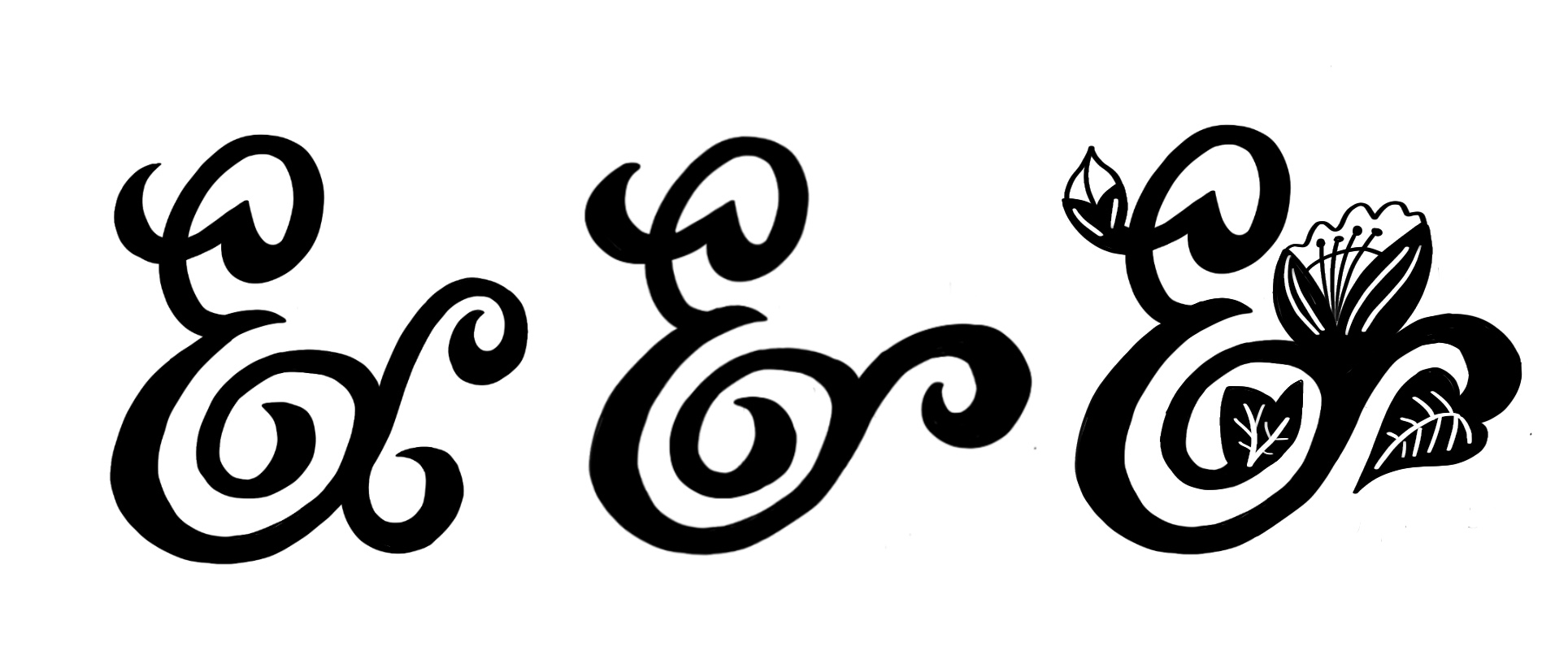
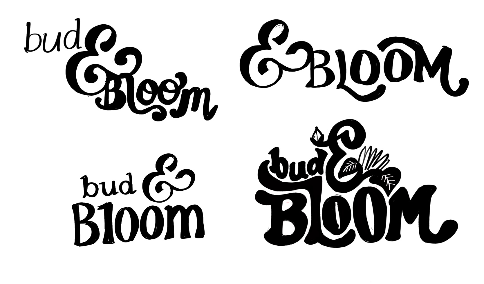
Next I moved onto lettering. My intention was to simplify ‘bud’ and increase the size of ‘bloom’ while adding more intricate details and flourishes to it. These sketches show the logo taking shape.
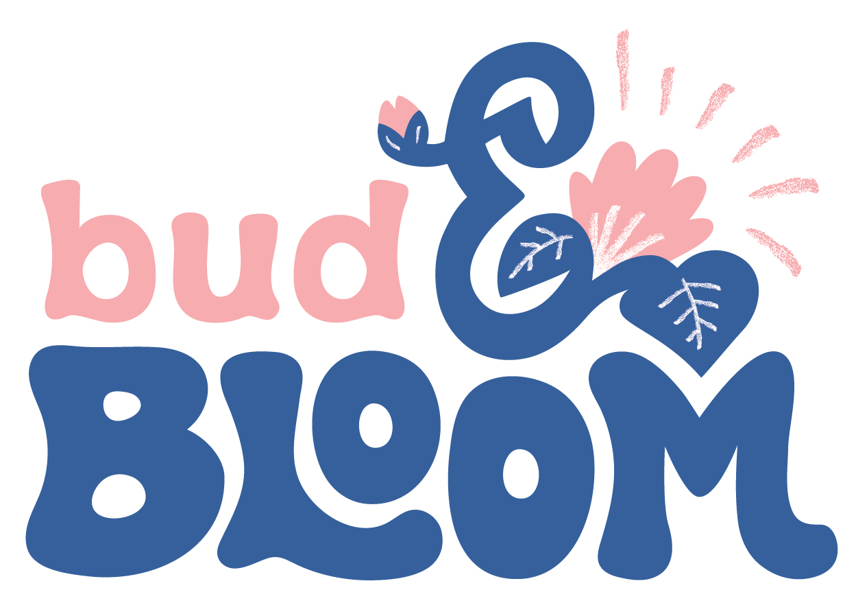
Primary logo and alternatives
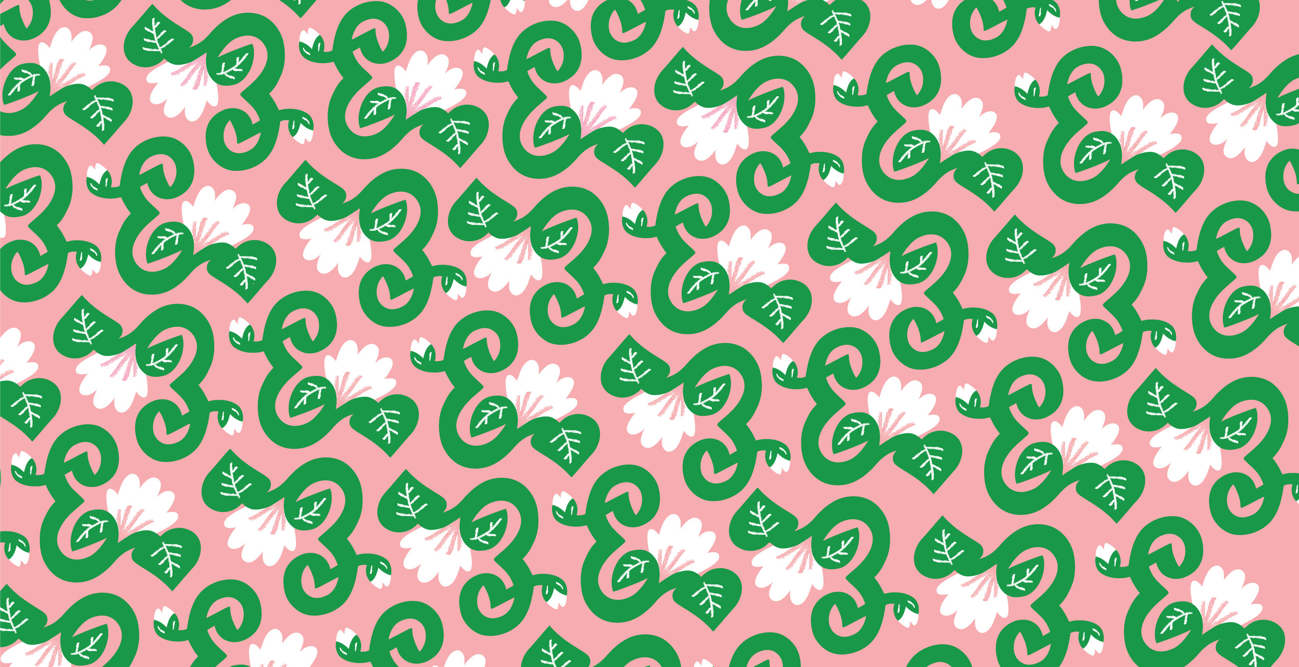
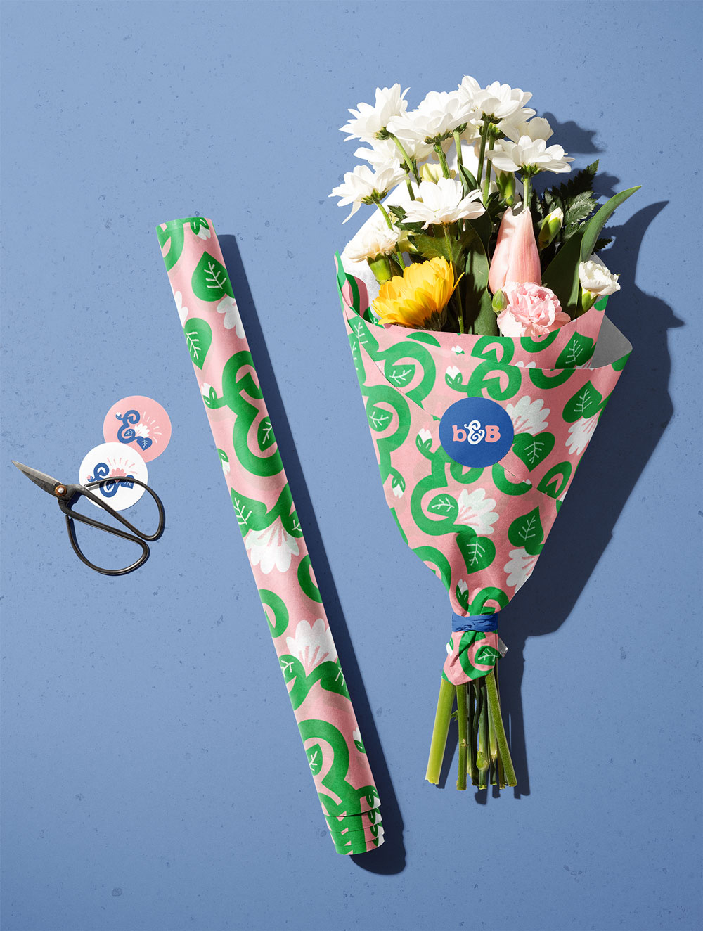
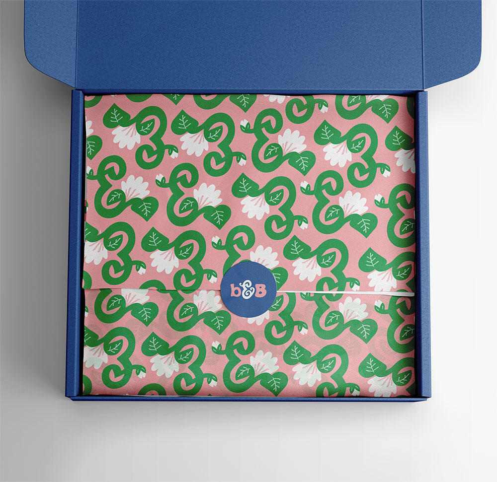
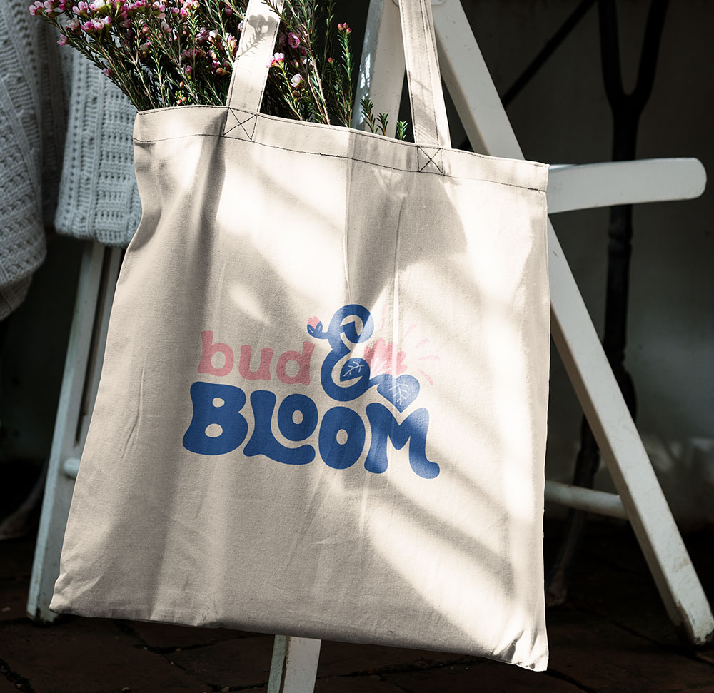
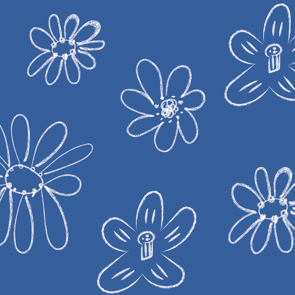
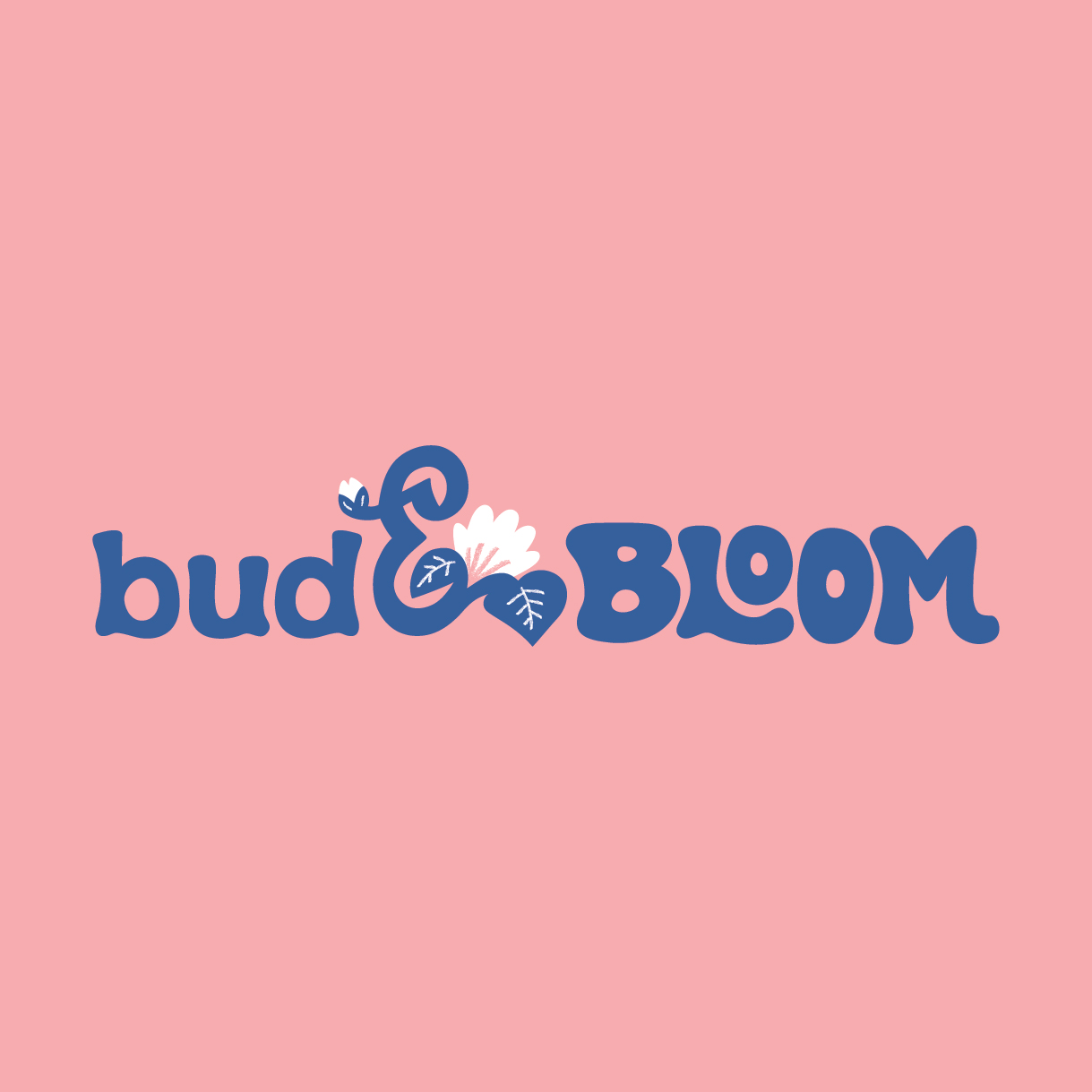
As the lowercase bud grows and transforms into a bold and vibrant uppercase BLOOM, the illustrated ampersand serves as a bridge between the two. The playful hand-drawn typography depicts movement and growth. I was keen to include the sketch like quality from my earlier bud and flower drawings somewhere within the logo, to evoke a sense of natural and handcrafted beauty, reminiscent of the work of a florist. Therefore a rough, pencil-like texture has been incorporated into the ampersand illustration. This is a recurring element throughout the brand.
Colour palette
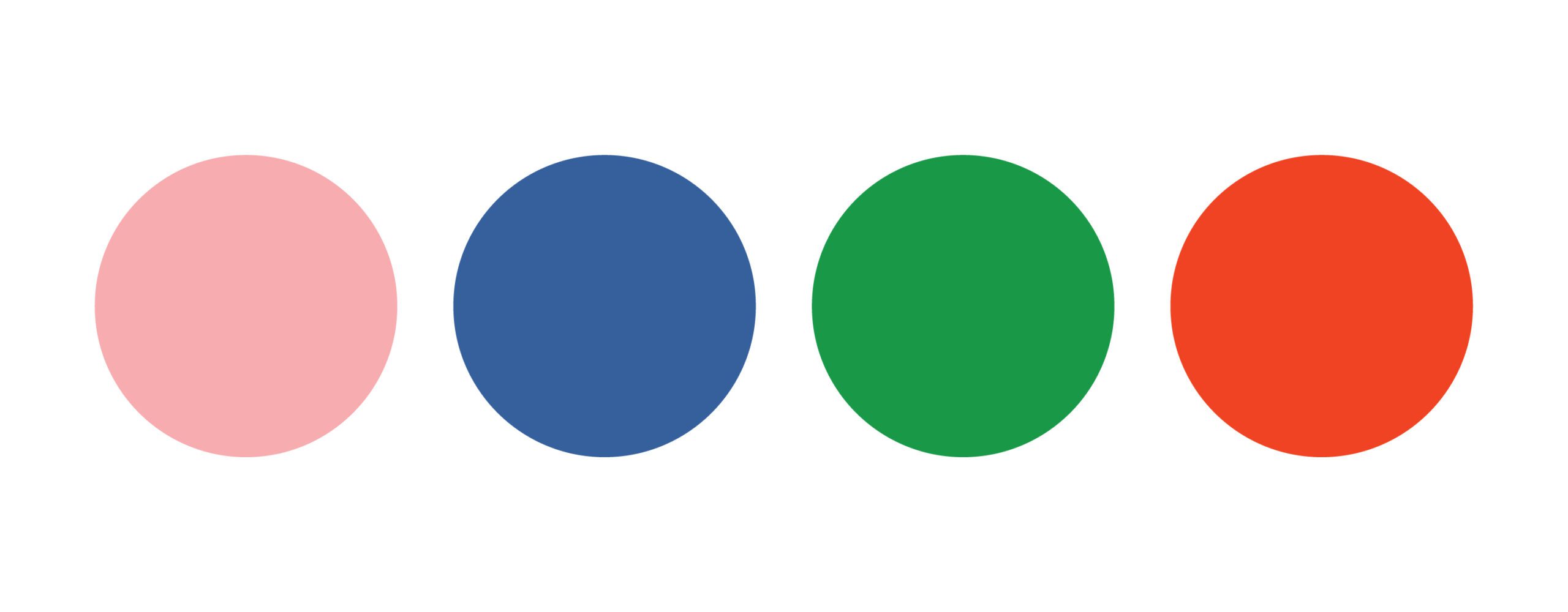
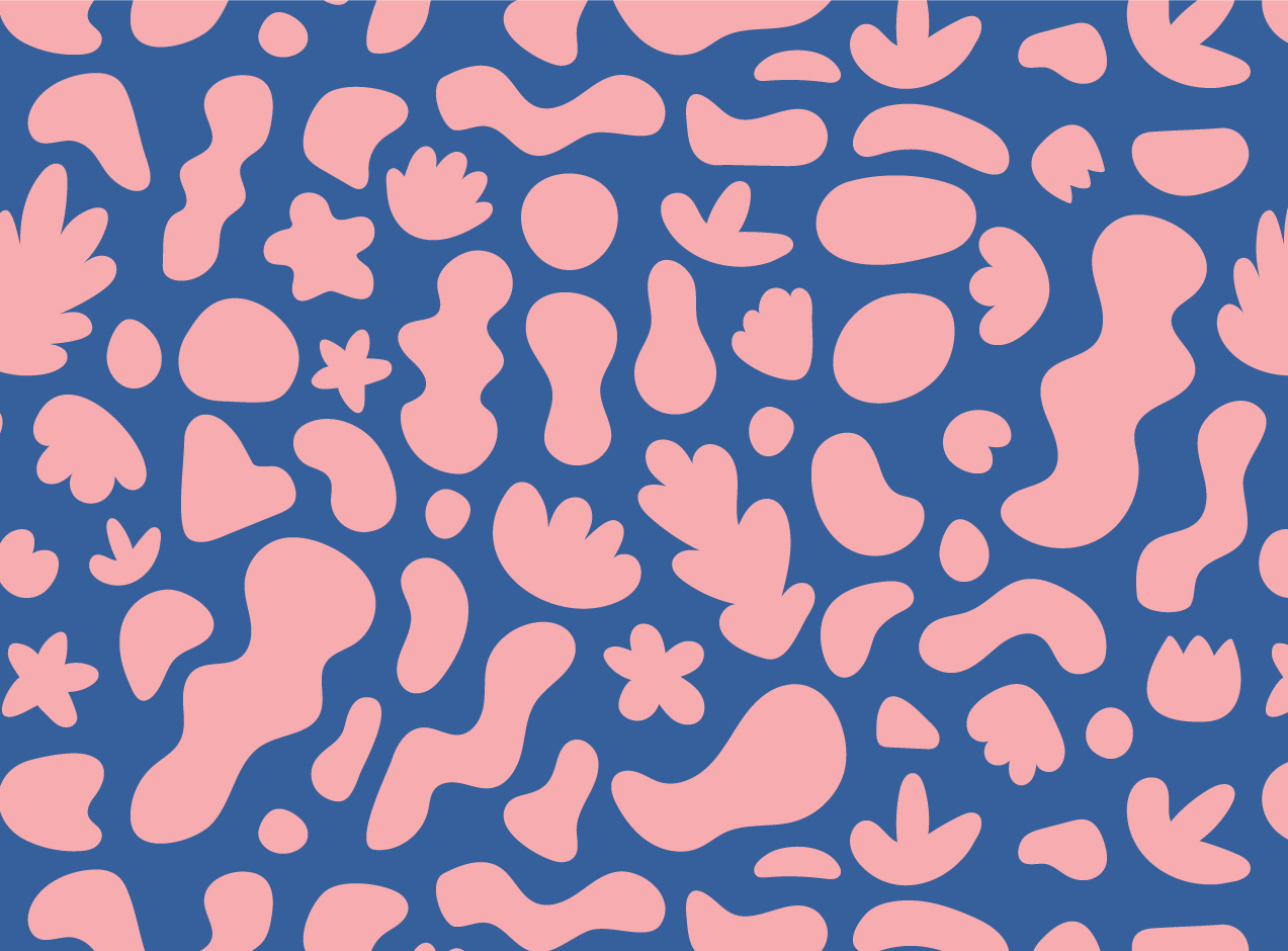
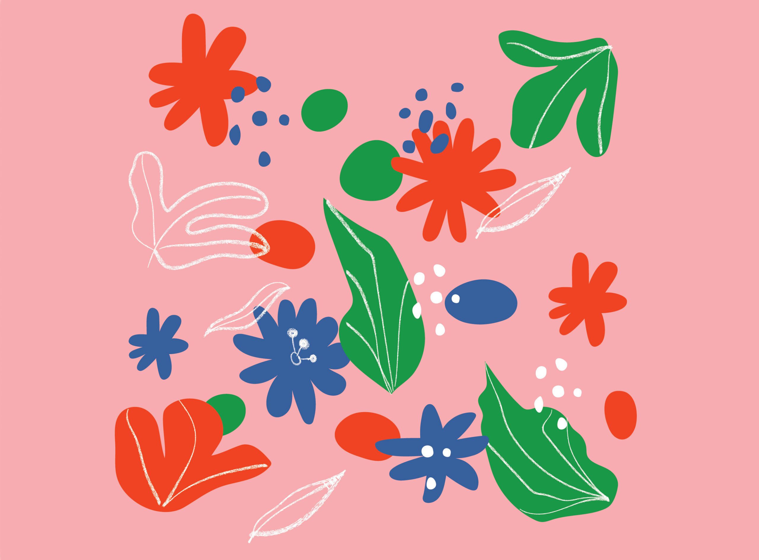
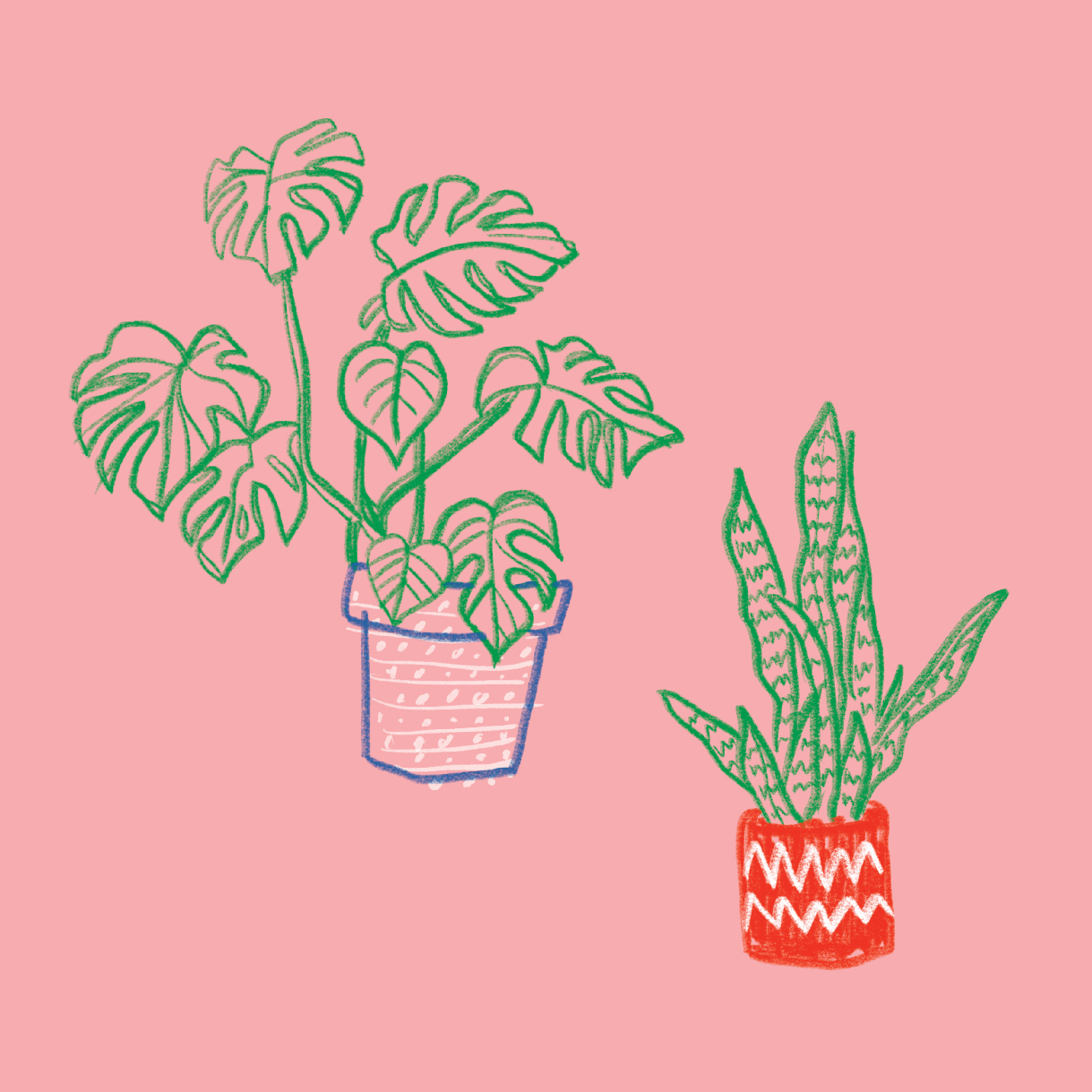
The warm, feminine pink exudes a welcoming and pretty vibe reminiscent of delicate flowers. It contrasts beautifully against the blue which evokes feelings of calmness and serenity, resembling a clear blue sky. Plants are excellent for mental health and the colours have been chosen to convey this. The green pops against the pink and represents growth, health and harmony. Finally the red accent colour adds a splash of excitement and can be used to draw attention to specific elements of the brand, such as promotions or new products.
