The Good Taco
Overview
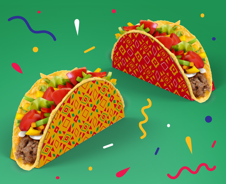
A family run Taco restaurant serving delicious home-made Mexican dishes, using fresh, high quality ingredients and unique recipes. The Good Taco focus on bringing friends and family together for good times and a friendly, casual dining experience.
Services
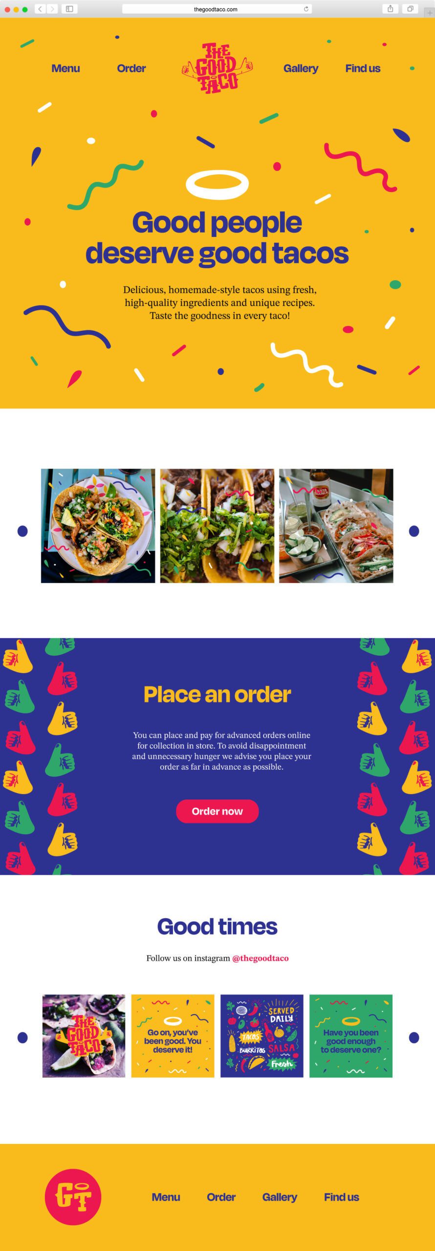
Logo & branding, illustration, surface pattern, packaging, social and web design
Keywords
Mexico, Food, Fun, Vibrant, Hands-on, Community, Connection, Fiesta
Mood board and creative direction
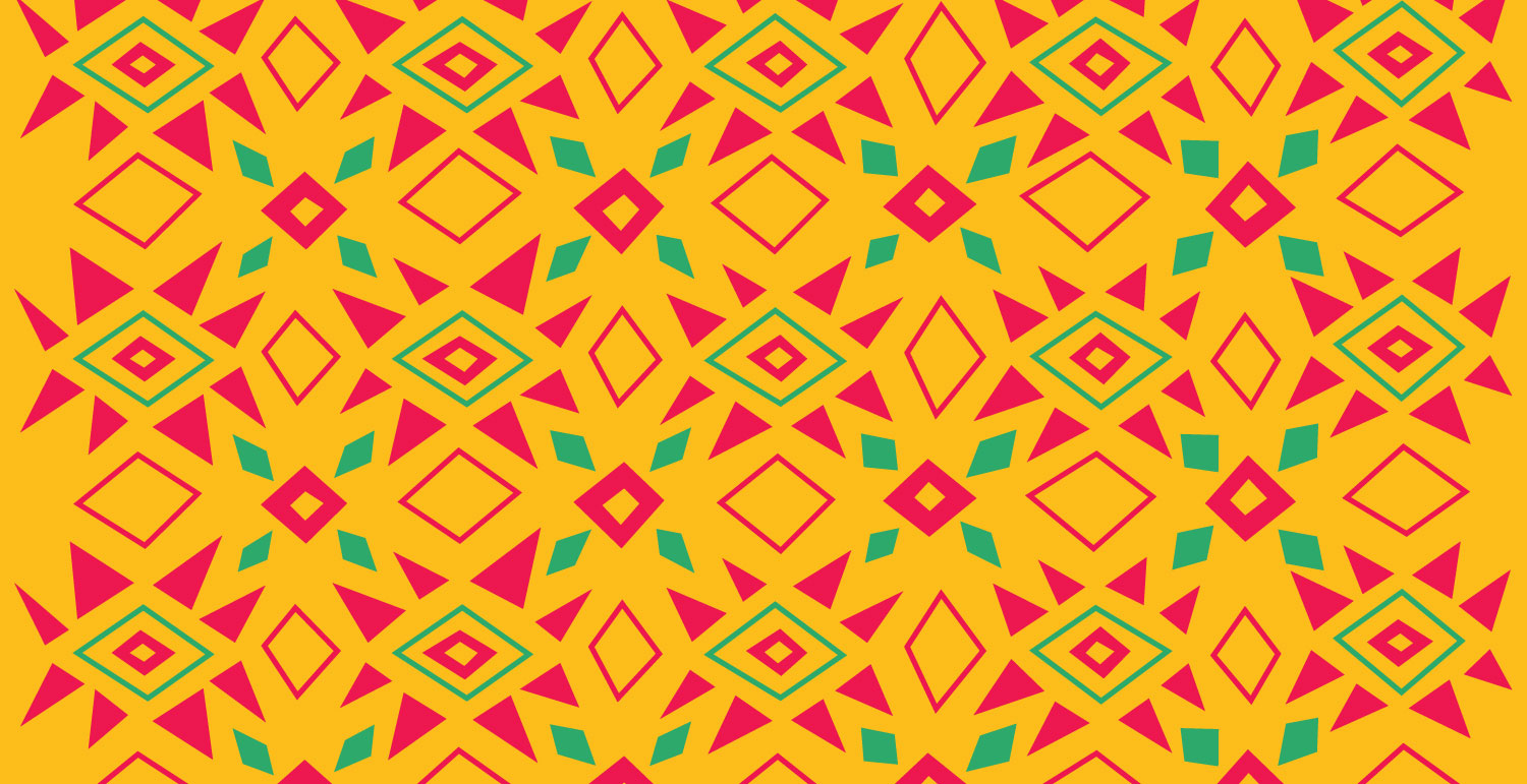
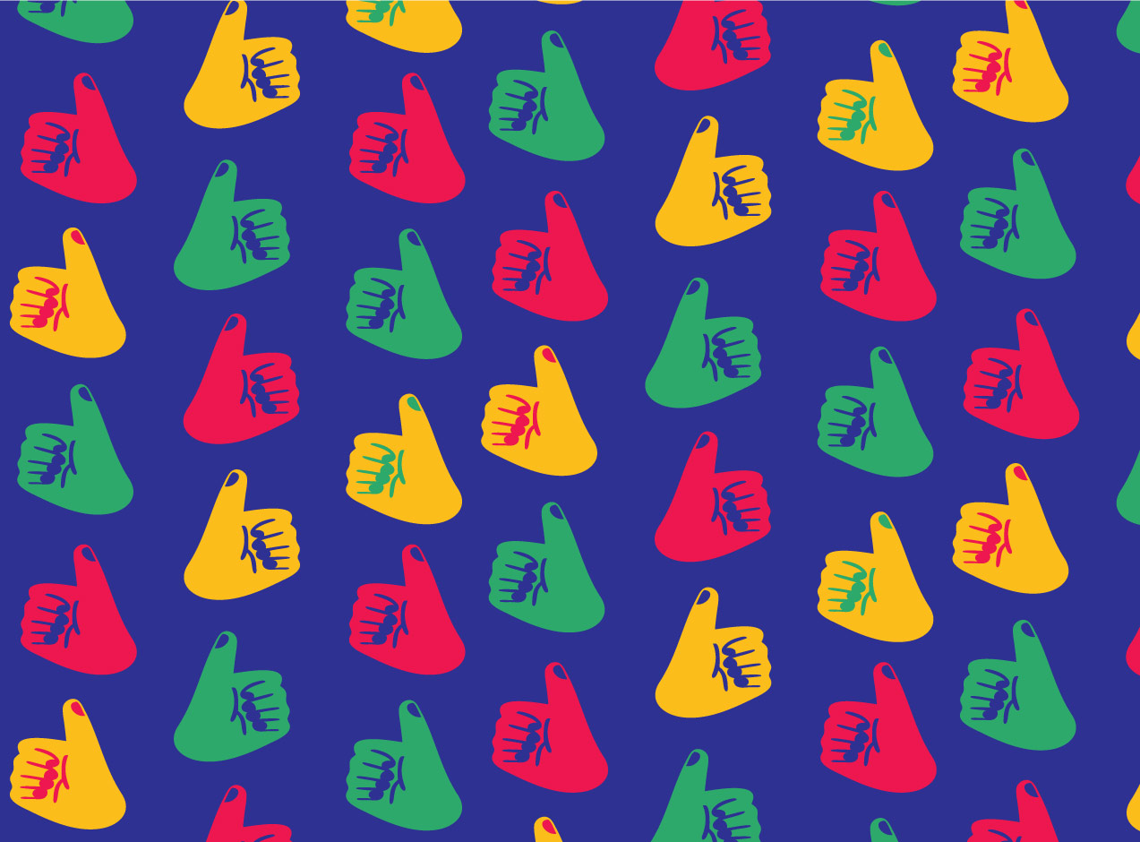
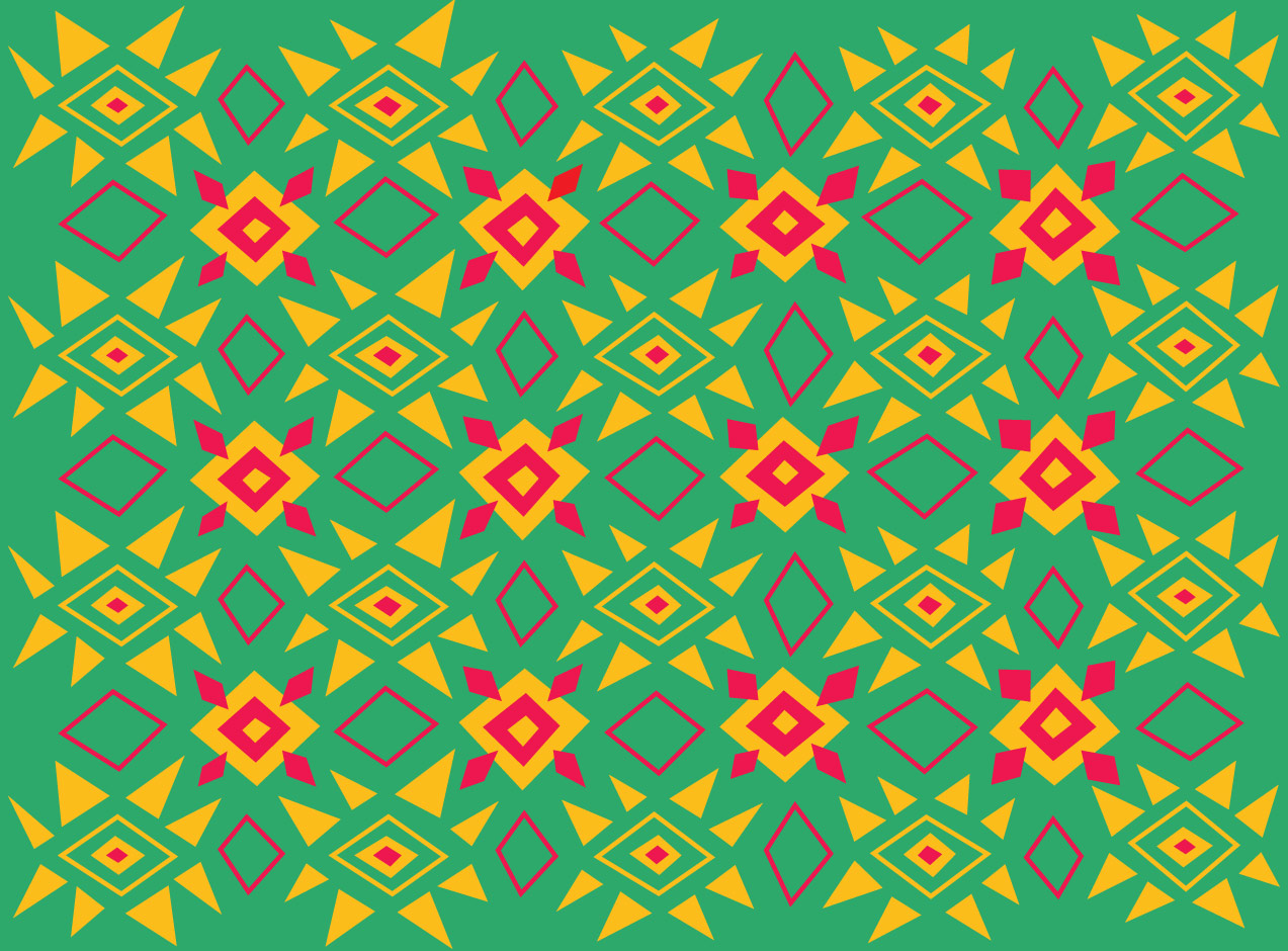
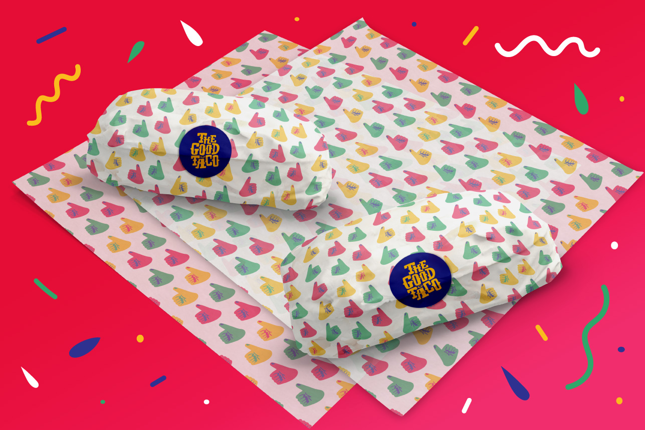
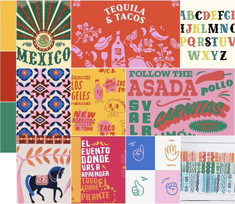
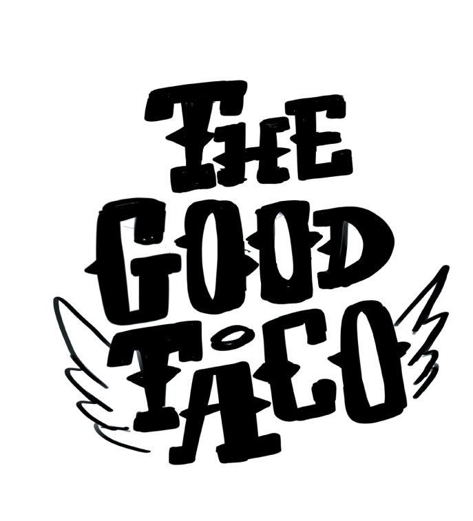
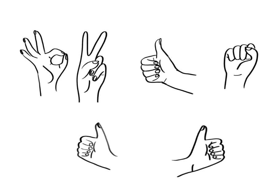
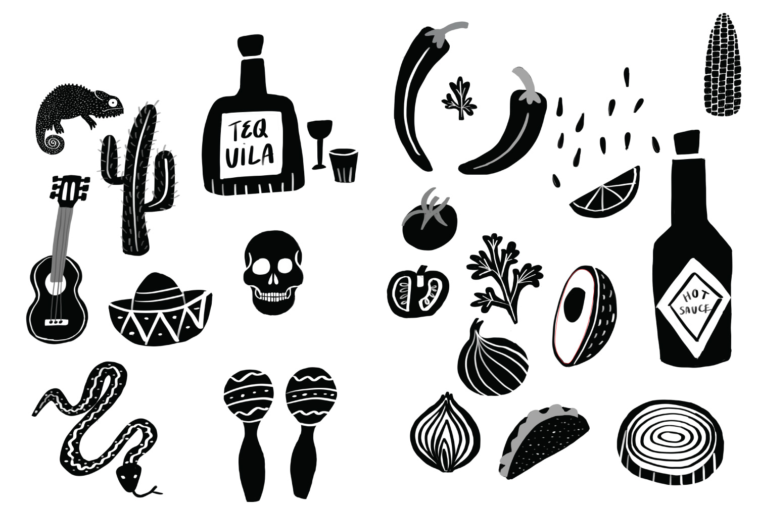
Since tacos are a quintessential Mexican dish, the design direction drew heavily from Mexico. Inspiration stemmed from various sources such as the vibrant colours of the Mexican flag, the chunky serif fonts of Mexican-style lettering, and the beautiful intricate patterns seen on Mexican tiles, rugs, and tapestries. I also wanted hands to be present in the design since eating tacos is a very hands on activity, and a thumbs up gesture is universally recognised as a way of indicating something good. Early sketches are shown below.
Primary logo and alternatives
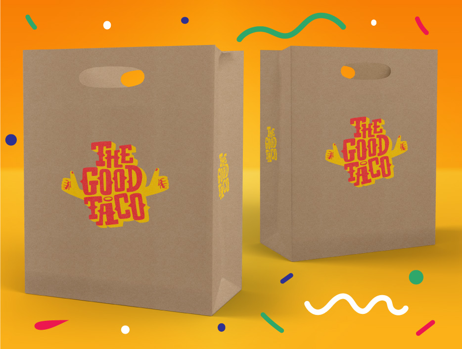
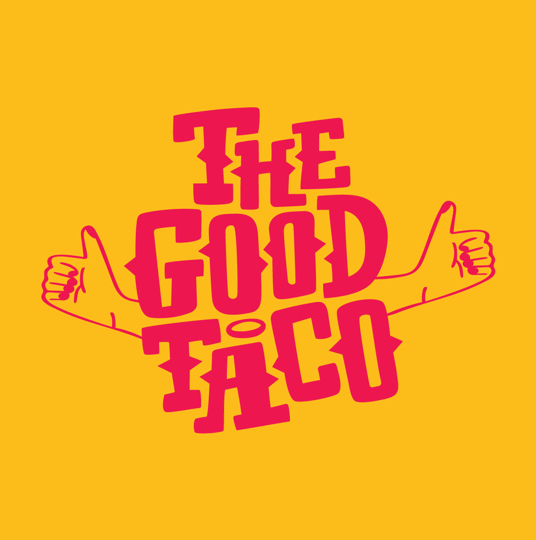
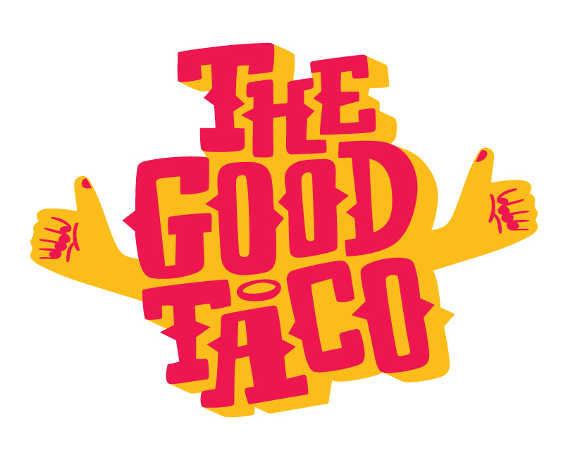
The logo is mainly typographic, inspired by chunky serif Mexican style lettering, while retaining a playful hand-drawn aesthetic. The design features a halo and thumbs up to represent ‘good,’ while hands are also used to symbolise the act of eating and sharing food within a community. This logo is versatile and can be effectively utilised with the text alone or with the hands included.
Colour palette
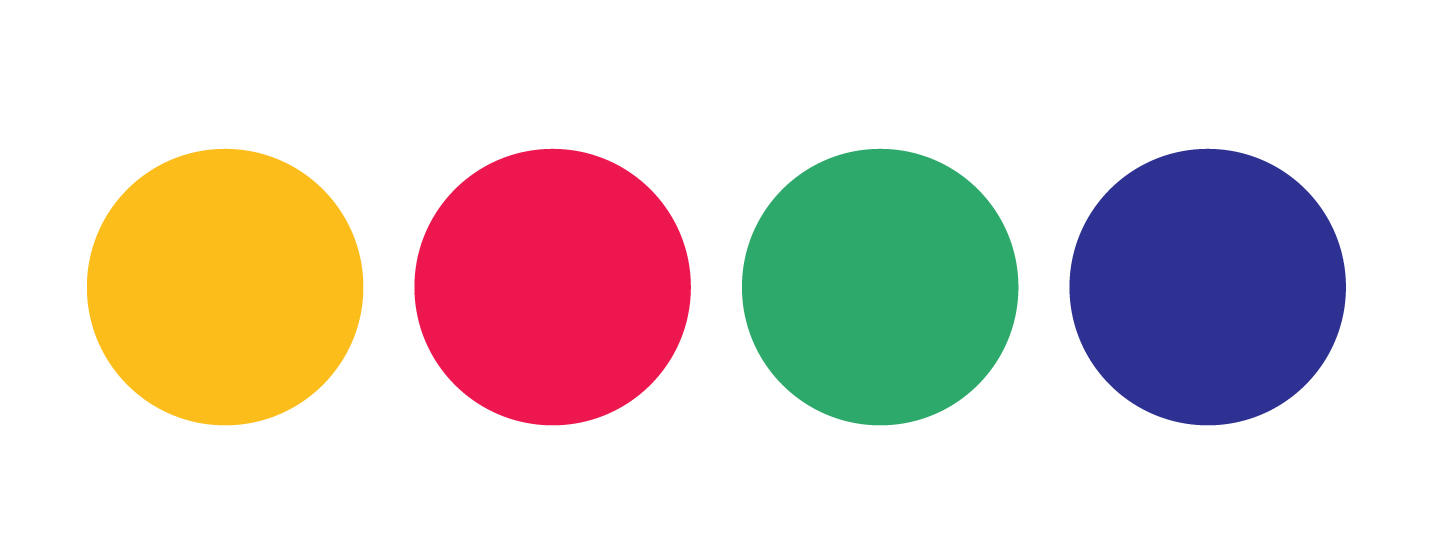
The colours have been chosen specifically to be fun and playful, but I’ve also carefully considered the Mexican flag and cuisine. The warm yellow for Tacos, nachos and burritos. The hot pink for salsa or hot sauce, the green for coriander or lime. The pink and green are also a modern take on the colours from the Mexican flag. The dark blue makes all the colours pop by contrast. This is a fun, loud, vibrant brand and the colours reflect that.
