The Gourd Gathering
Overview
The Gourd Gathering is a pumpkin patch that offers an authentic and festive autumn experience for families and friends. Nestled in the picturesque countryside, The Gourd Gathering provides a warm and welcoming atmosphere where visitors can enjoy pumpkin picking, local produce and family activities.
Services
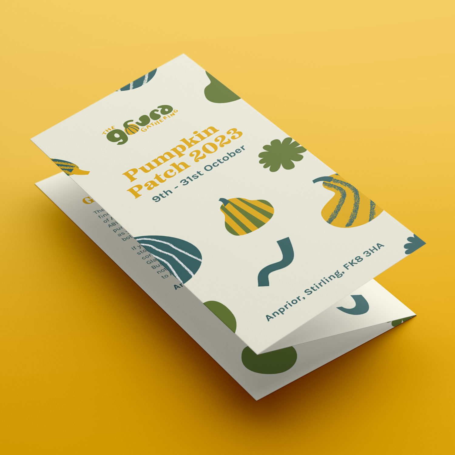
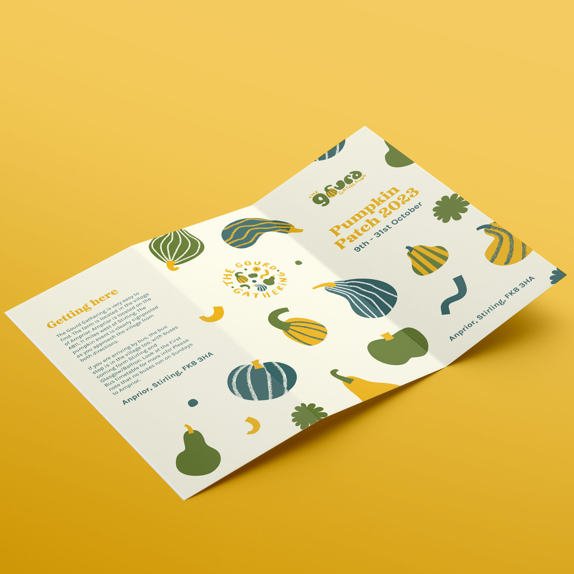
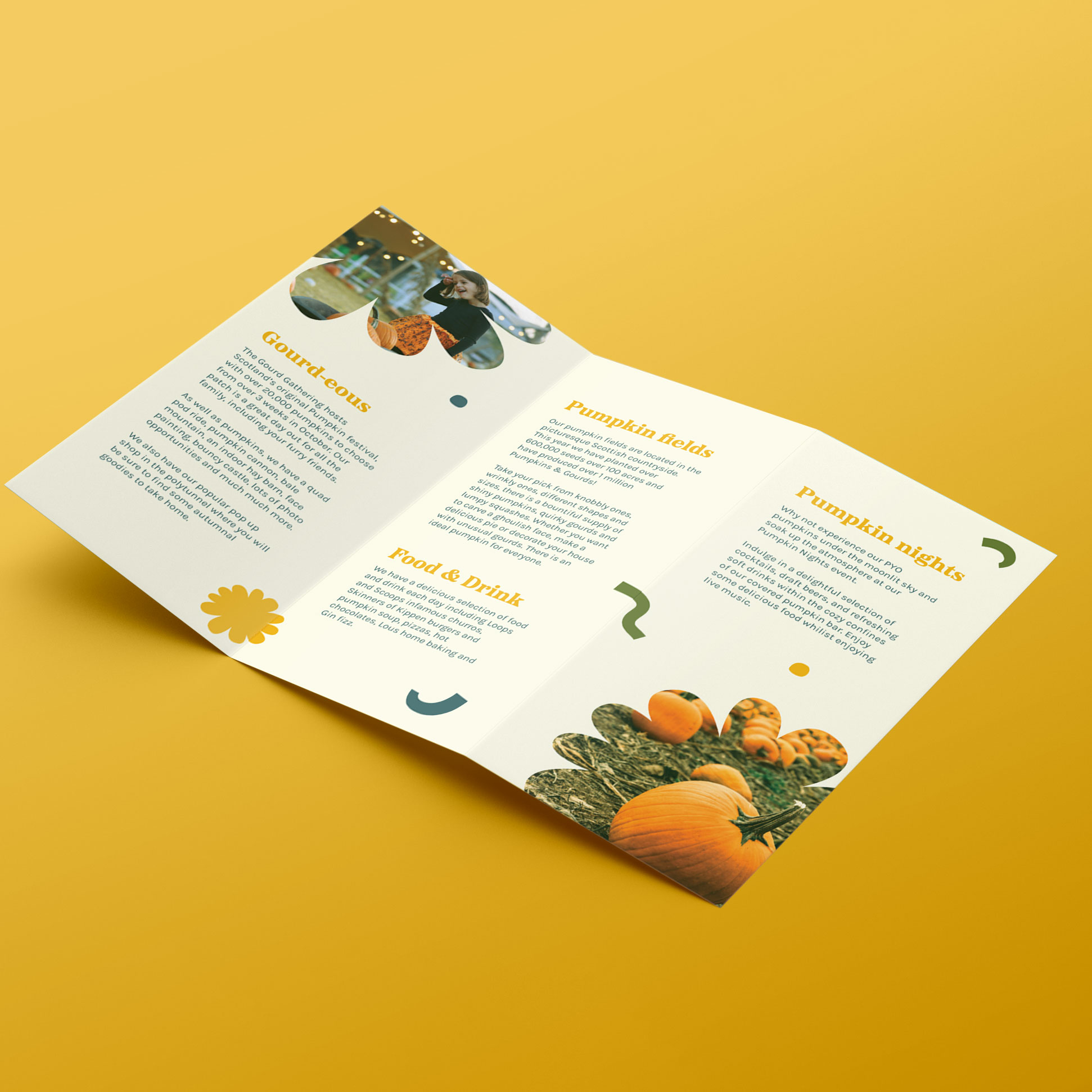
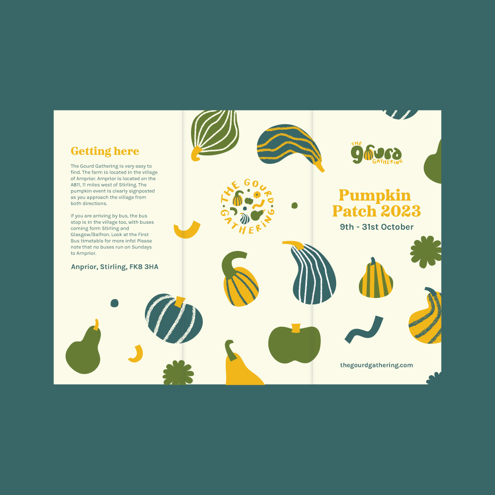
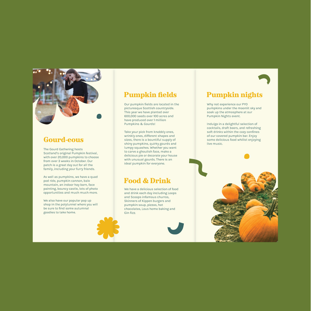
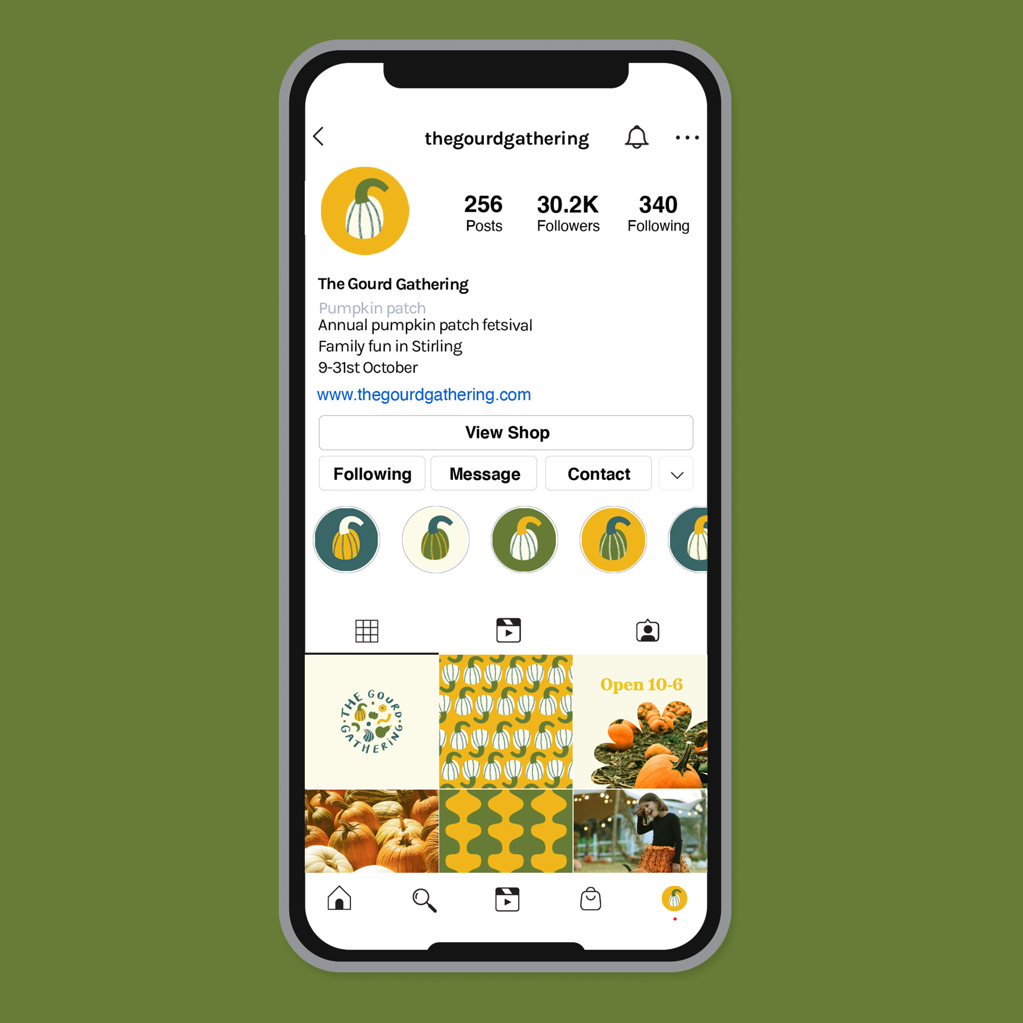
Logo & branding, illustration, brand patterns, socials, leaflet design
Keywords
Autumn, Harvest, Wholesome, Natural, Handcrafted, Family-friendly, Fun, Gourd, Pumpkin, Playful, Community
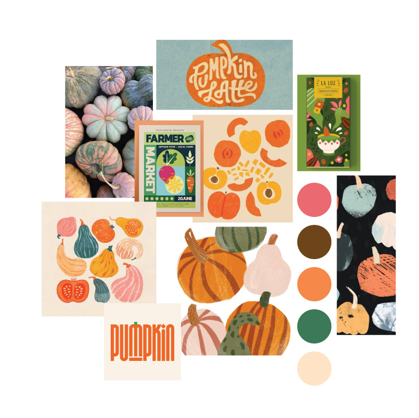
Mood board and creative direction
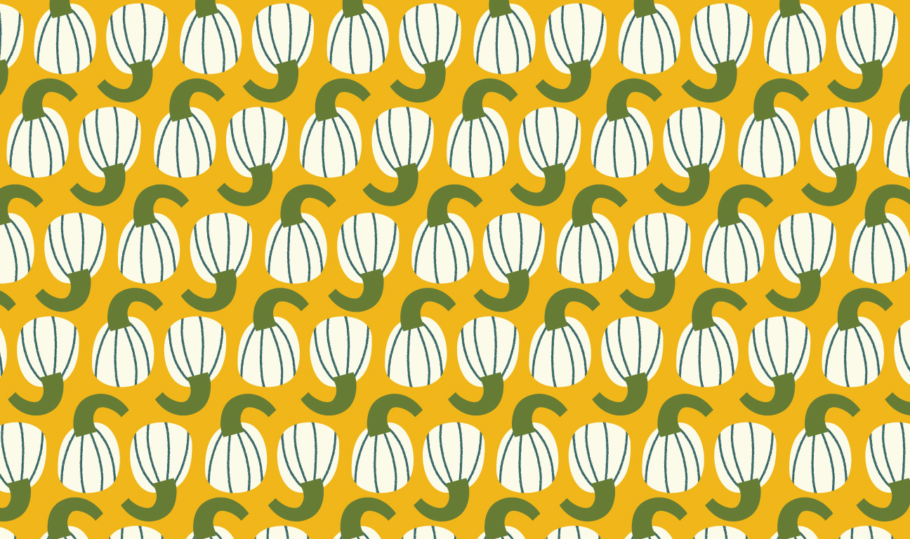
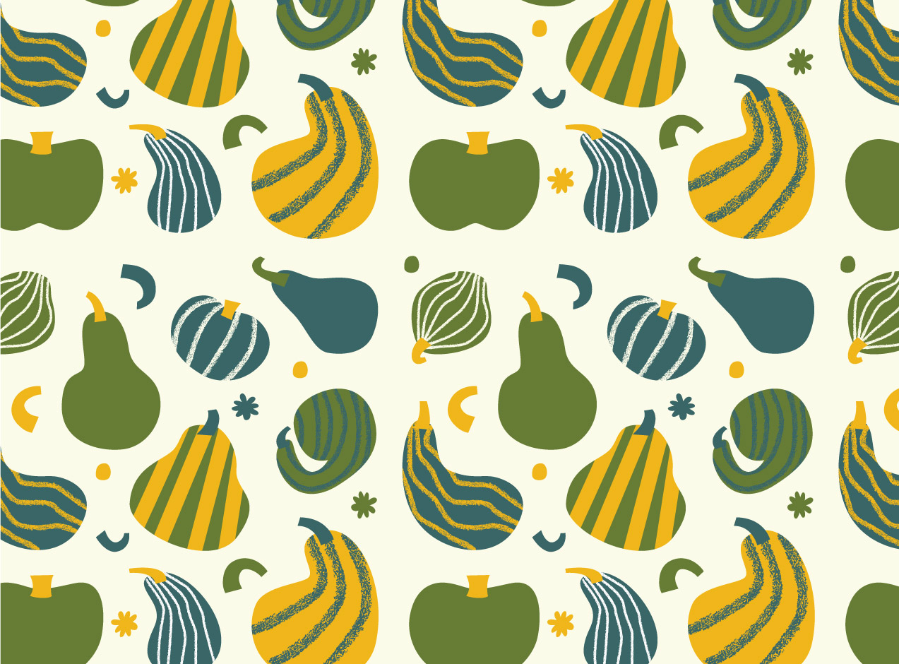
The logo and brand should appeal to adults to children alike so I wanted it to be fun and playful but not look too childish. I also intended to include the shapes and colours of gourds within the logo. My aim was to create a hand-drawn typographic logo with the letterforms resembling gourds. I also love the textures and patterns of gourds so I wanted to include these in the brand. Hand-drawn lettering would give the logo a playful, hand-crafted feel which would appeal to all ages. Early iterations are shown below.
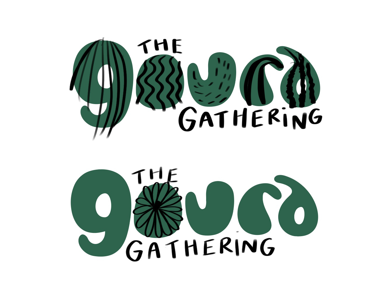
Primary logo and alternatives
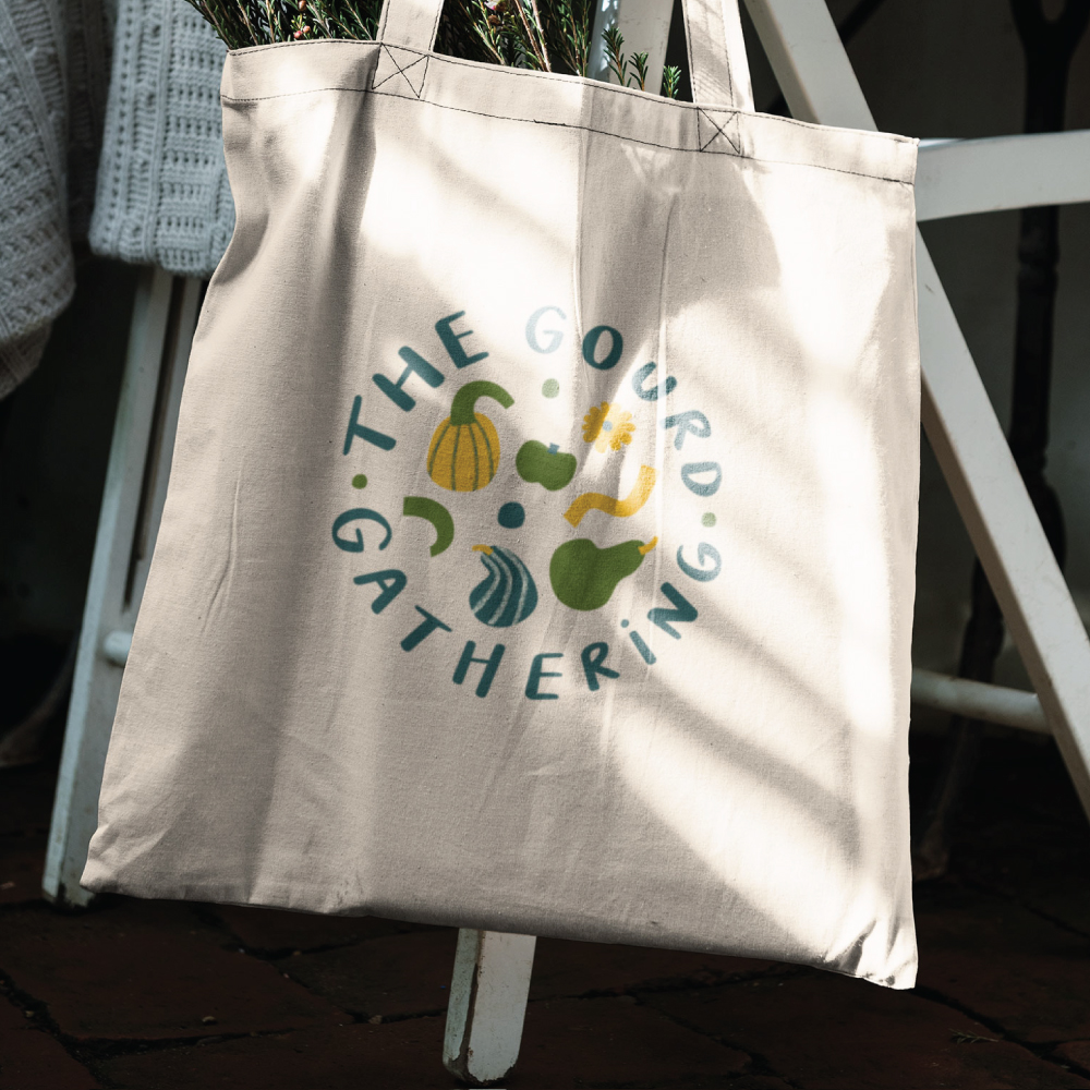
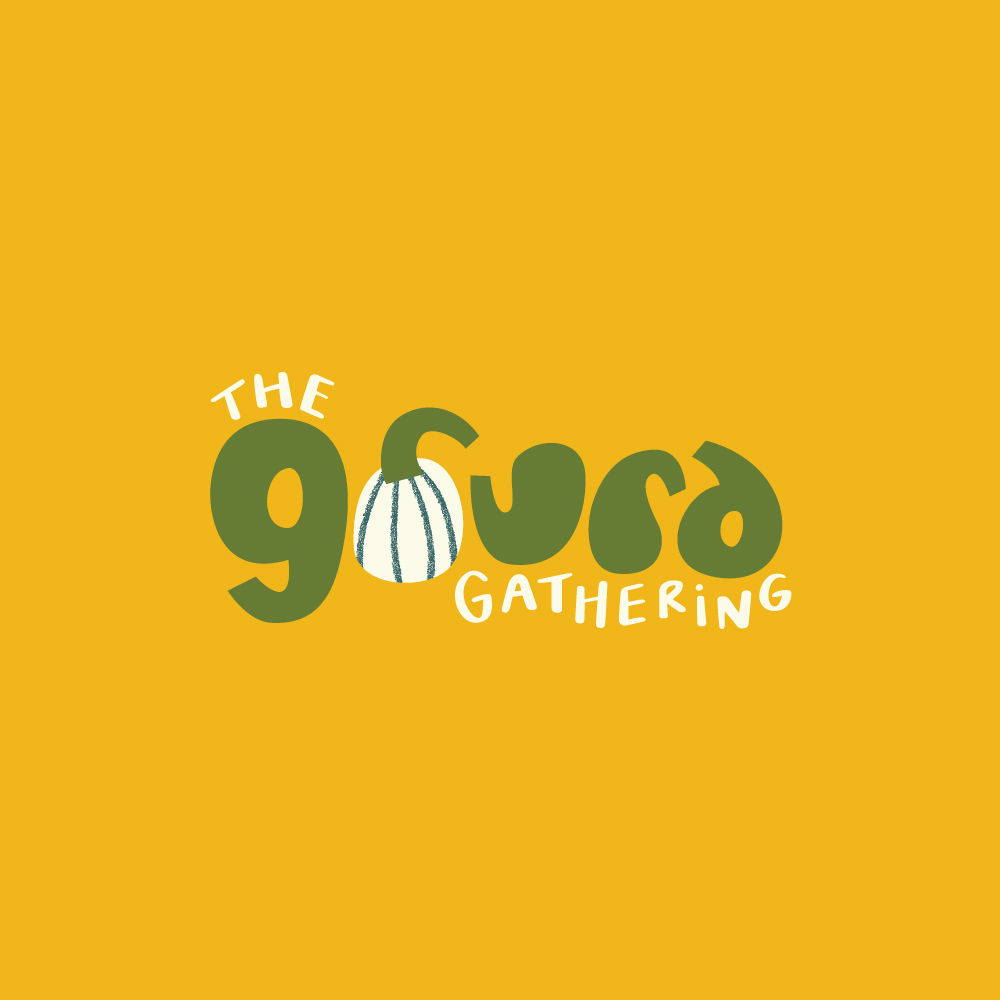
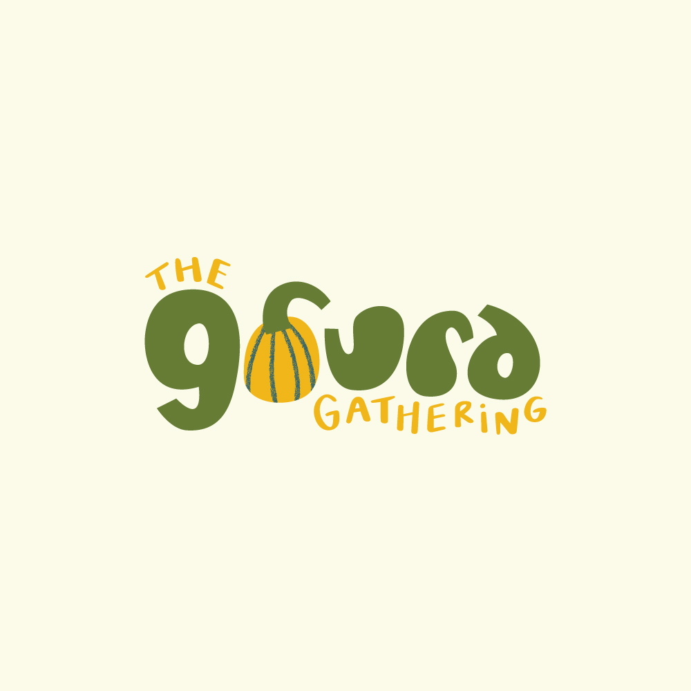
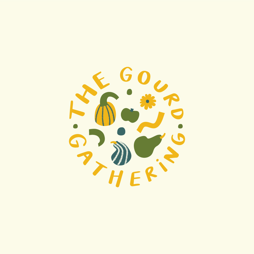
A fun and playful typographic logo, each letterform has been designed to resemble the shape of a gourd. The O has been replaced by a gourd illustrations and I mimicked their rough, rugged texture by using rough lines. The words ‘the’ and ‘gathering’ have been placed in an irregular way, adding to the playfulness of the logo. Every letter is hand-drawn, in keeping with the hand-crafted spirit of pumpkin patch experience.
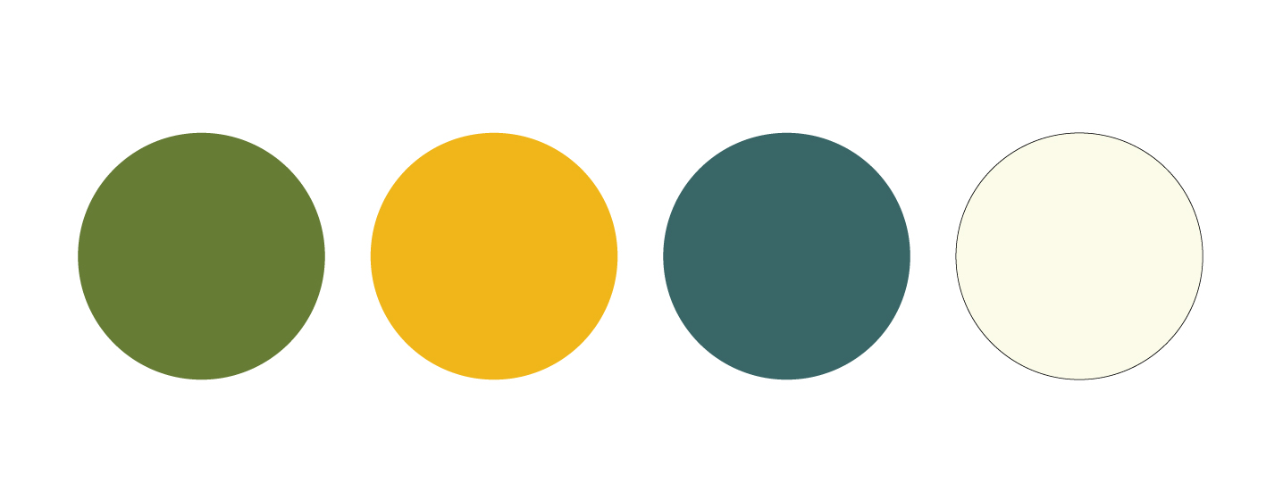
Colour palette
I’ve chosen deep, warm, autumnal colours for the brand, and colours that you would typically see in gourds. There’s an elegant contrast between the rich, earthy tones. The colours reflect the warm, welcoming and family-friendly spirit of the brand.
