The Hecate Kin
Overview
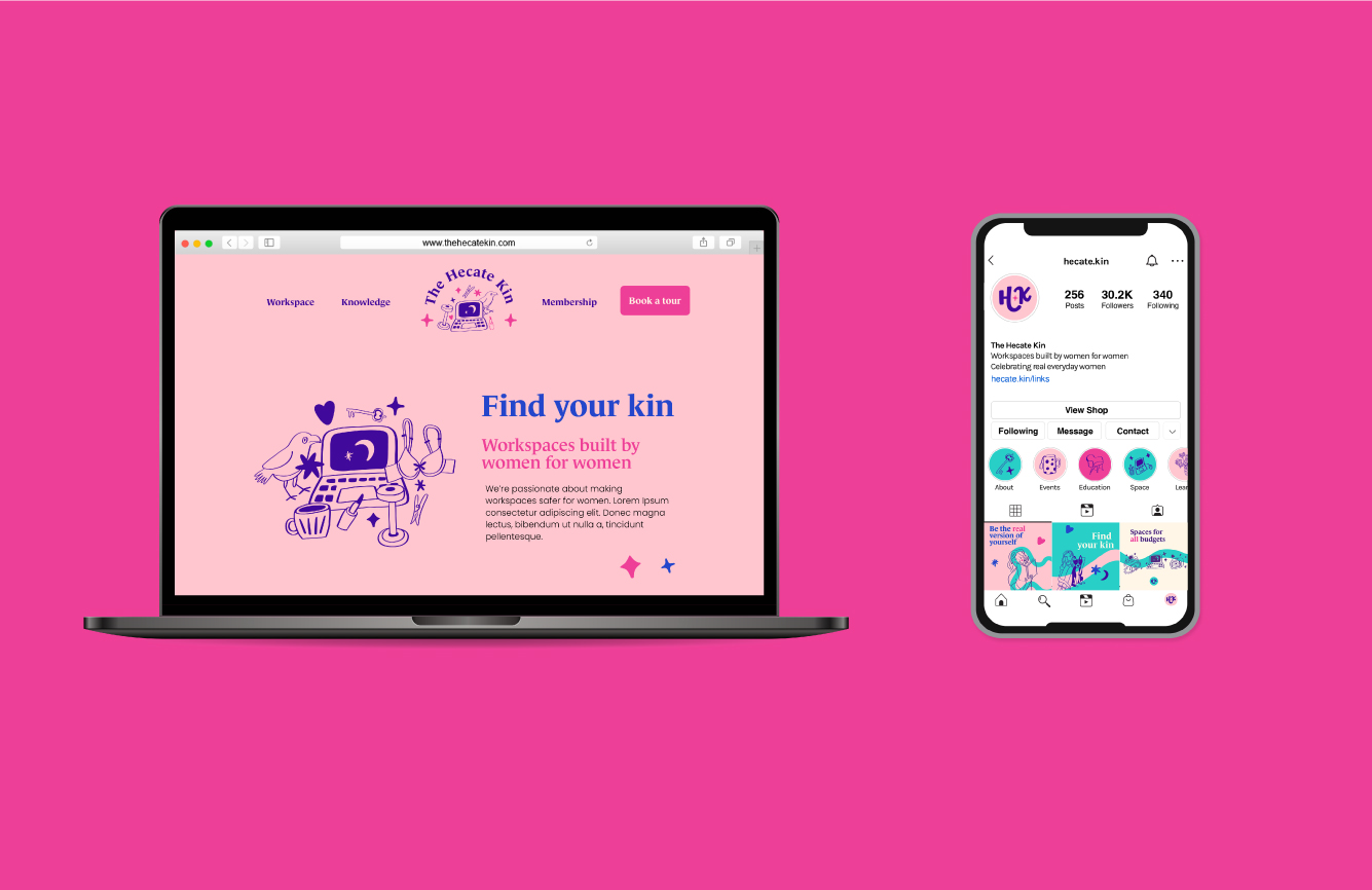
The Hecate Kin offers physical co-working spaces designed by women for women. Workplaces can sometimes be toxic and unsafe for women and The Hecate Kin aims to create a safe, uncompetitive, caring atmosphere for them, while providing connection and community to female business owners. The Hecate Kin also celebrates the ‘real’ life experiences of women, not everyone is a warrior/goddess, the little things and achievements that seem mundane in every day life are important.
Services
Logo & branding, illustration, brand patterns, PowerPoint, business card and web design
Keywords
Female-centric, Community, Authenticity, Familiar, Family/Kin, Hecate, Celestial
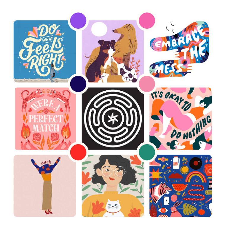
Mood board and creative direction
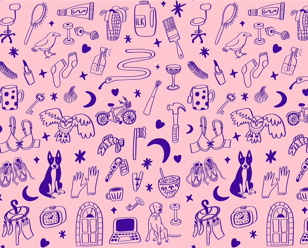
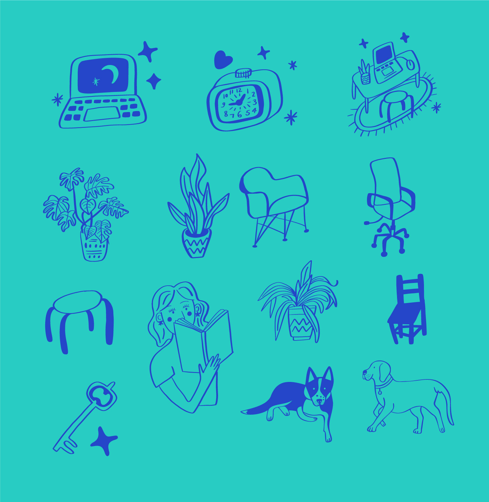
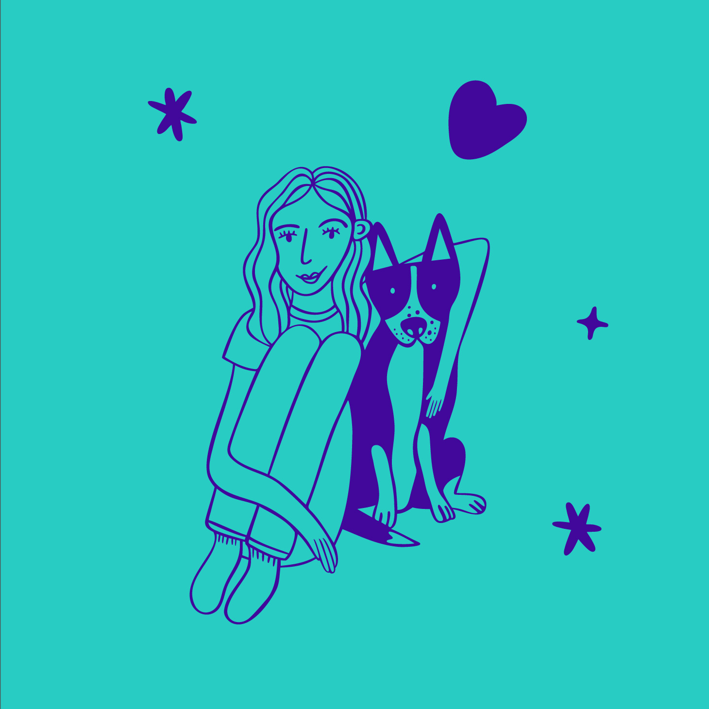
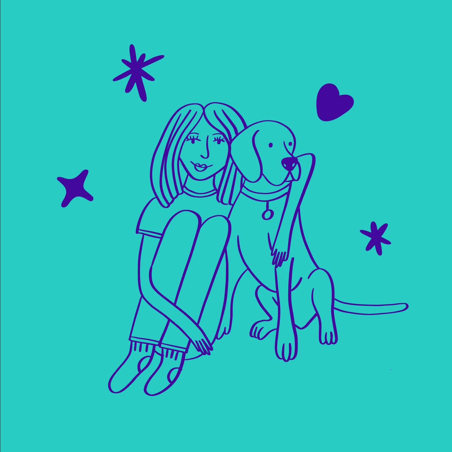
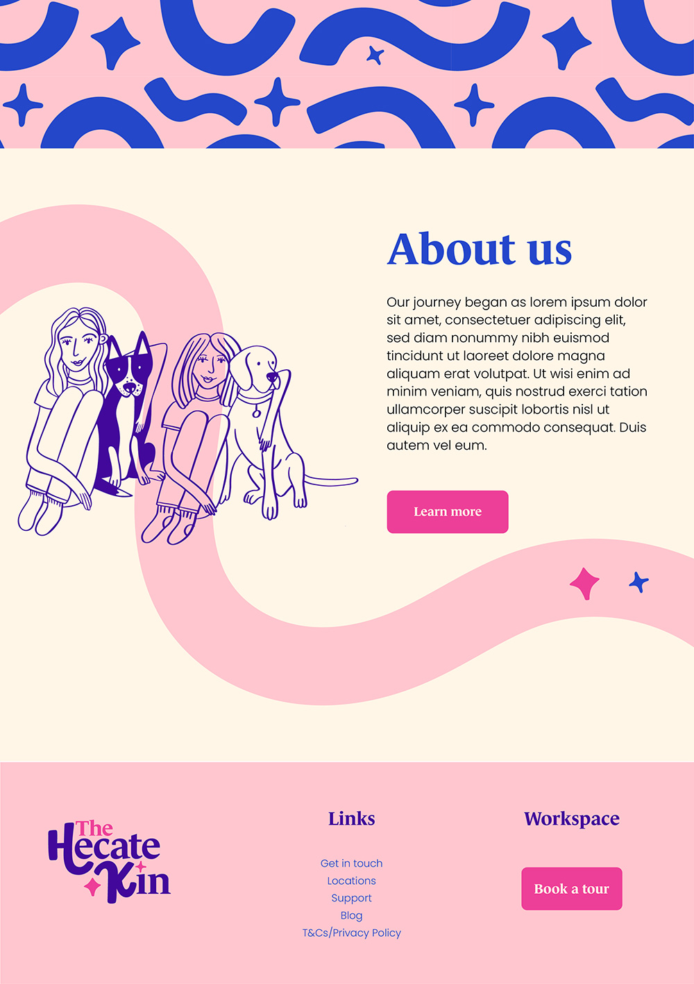
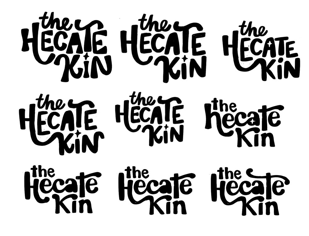
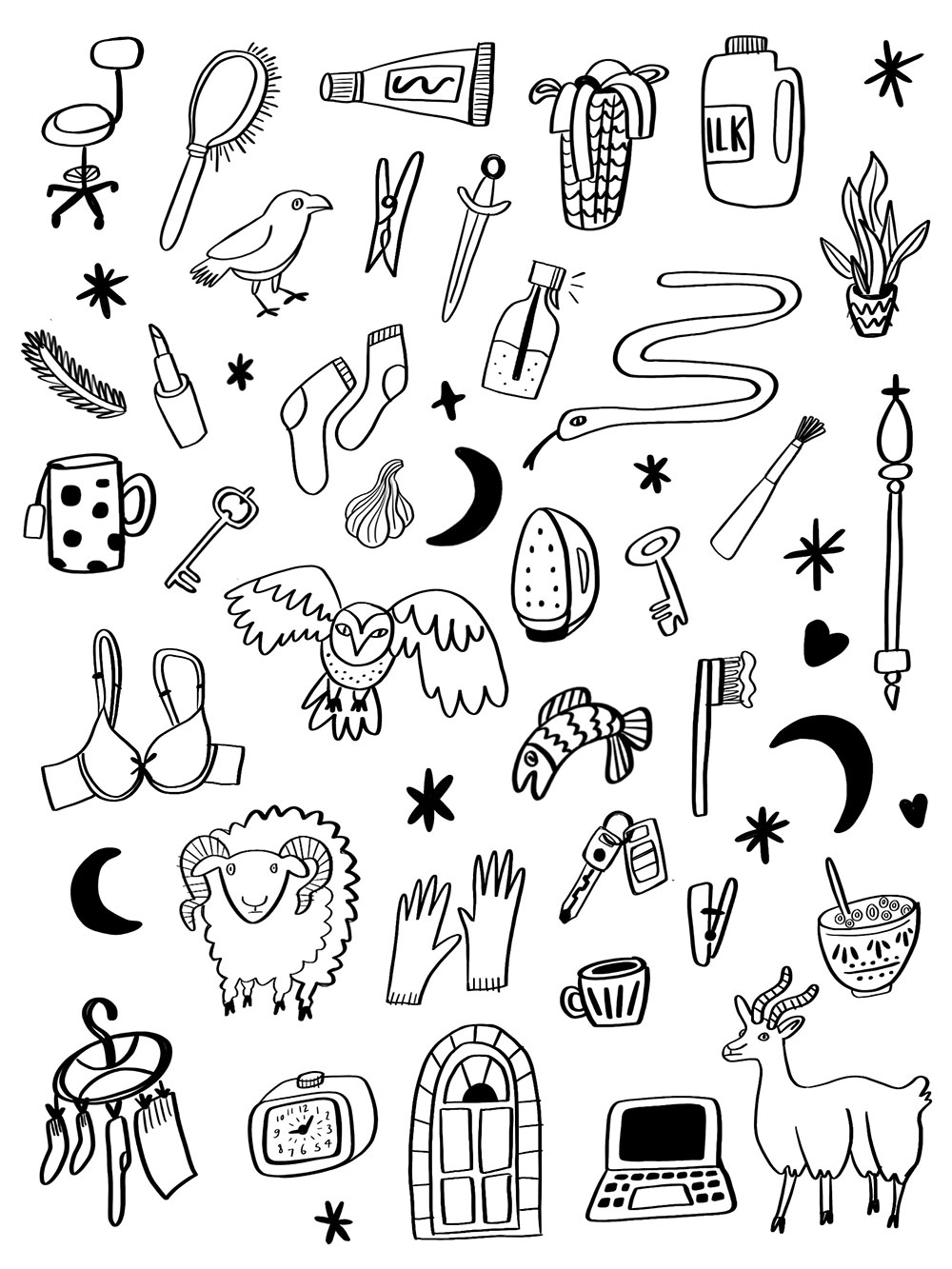
I wanted to showcase ordinary women by including plenty of illustrations of mundane items like milk, laundry, cereal, car keys etc. but also include drawings that relate to Hecate, who was a Greek goddess associated with witchcraft and necromancy, but was also a protector of women, children, and the home. Within the brand, I aimed to depict the journey women undertake in their careers, businesses, and personal lives by illustrating connections and progress through dynamic lines and movement. This representation highlights the intertwined paths of professional growth, family, and community. The founders Hannah and Kate love dogs and so their own dogs Bonnie and Frankie were featured within the brand. Sketches below show earlier iterations of the logo and illustrations.
Primary logo and alternatives
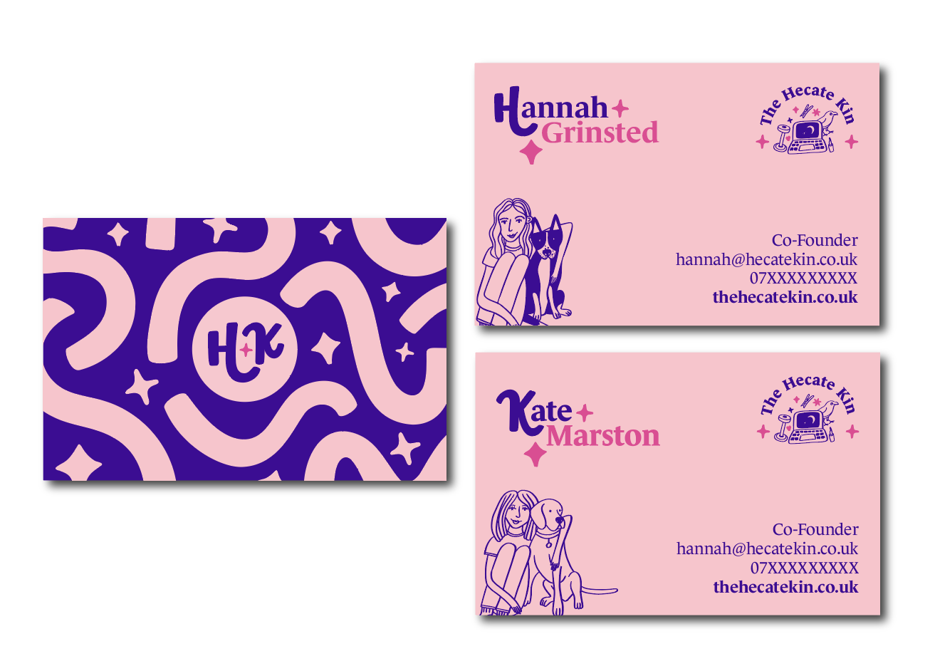
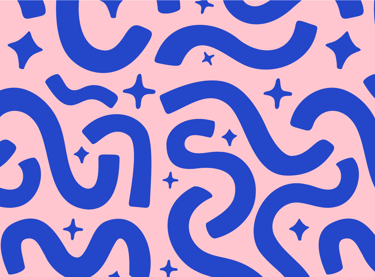
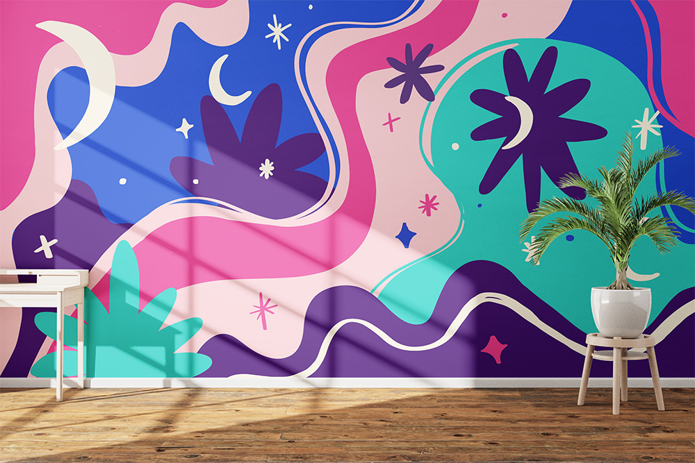
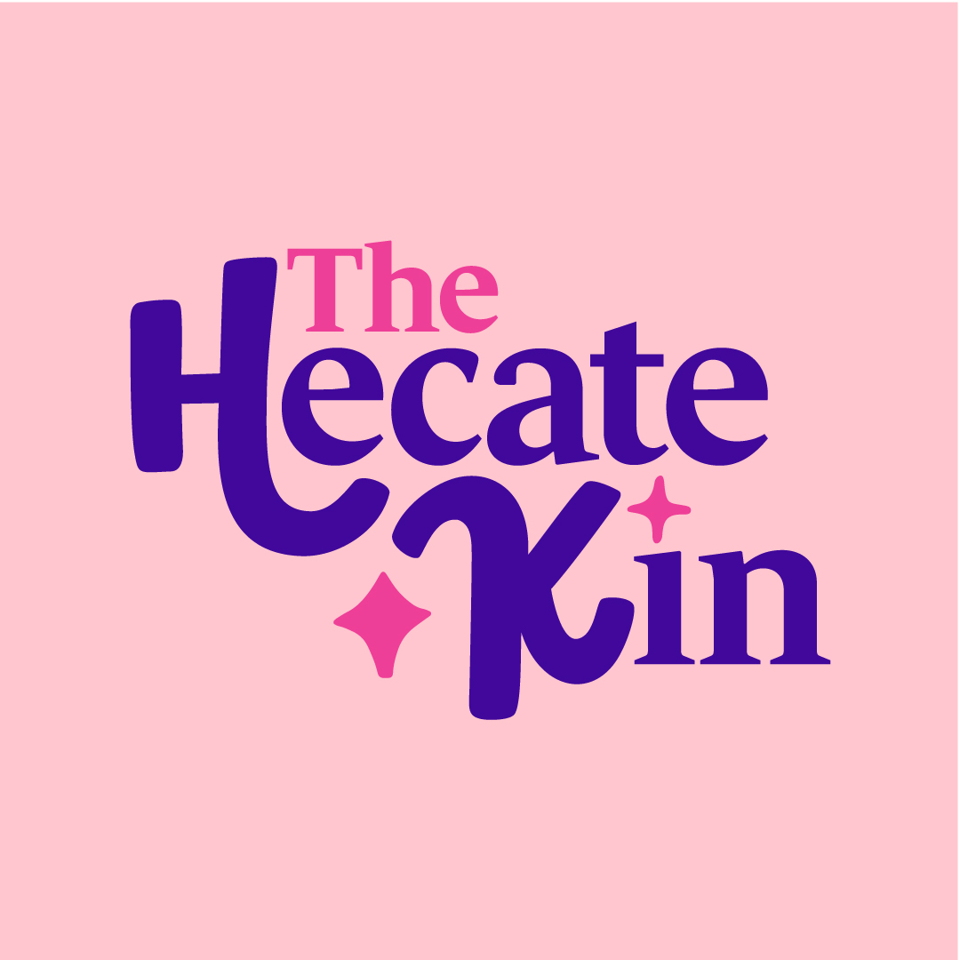
In the end myself and the clients felt that the illustrations were really strong and so we decided on a mostly illustrative logo with a sophisticated font that would contrast against them. The typography encompassing the illustrations represents a safe, friendly environment. Illustrations of every day items women use have been combined with symbols of Hecate. The concept of connection and a journey has been used throughout the brand, represented by wavy lines that travel and intertwine with one another. The H and K within the secondary logo and brand mark also represent the names of the founders Hannah and Kate.



Colour palette
Contrasting, feminine colours have been chosen for the three main brand colours, the clients love the peony flower, so a pale and bright version were chosen to contrast with one another. The secondary colours include vibrant blues that complement the primary colours beautifully. Cream has been chosen as an accent colour. All the colours were chosen to be bold and eye-catching.

