Wild and Organic
Overview
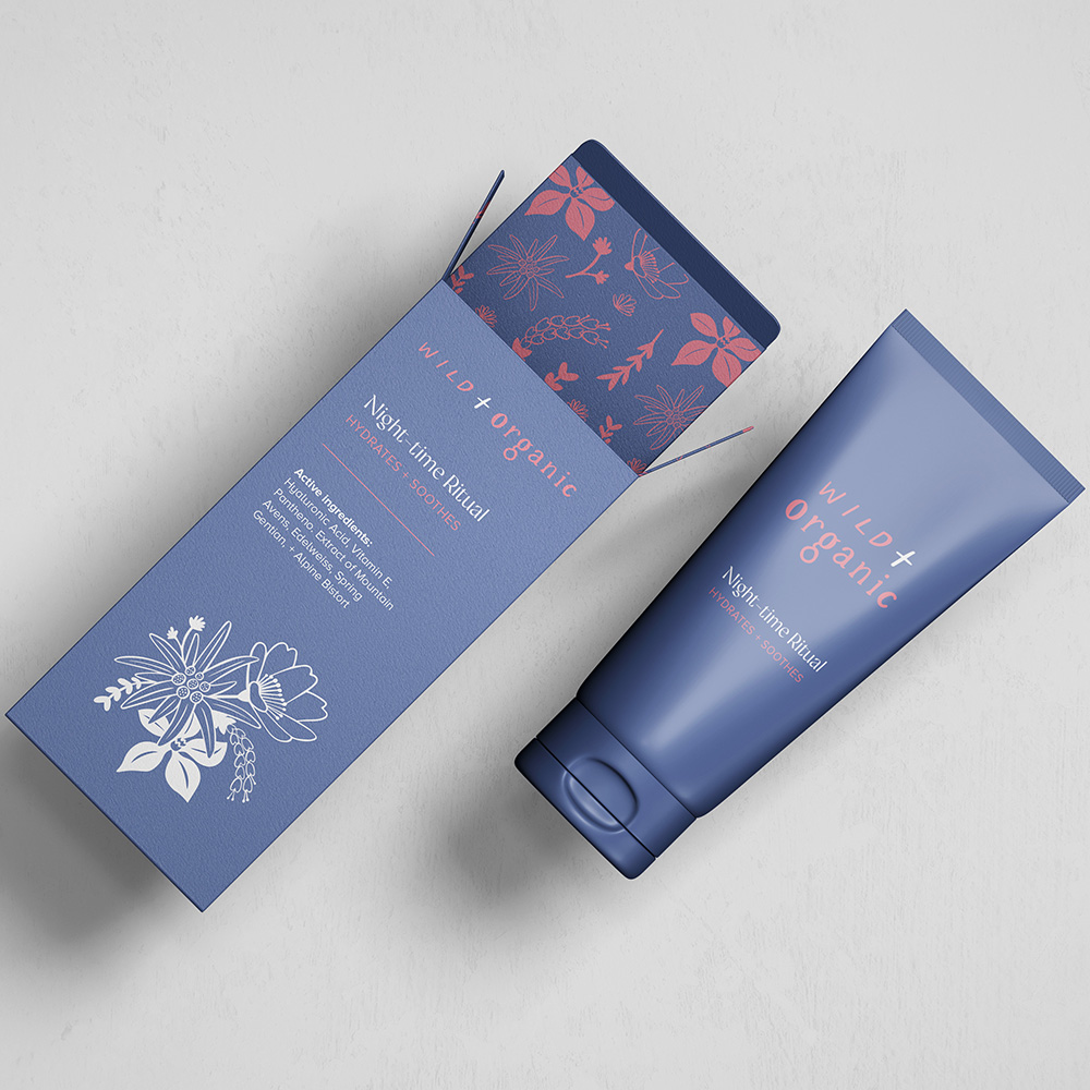
Wild and Organic is a skincare brand dedicated to harnessing the power of nature for radiant, healthy skin. Their products are infused with Swiss alpine botanicals, renowned for their purity.
Services
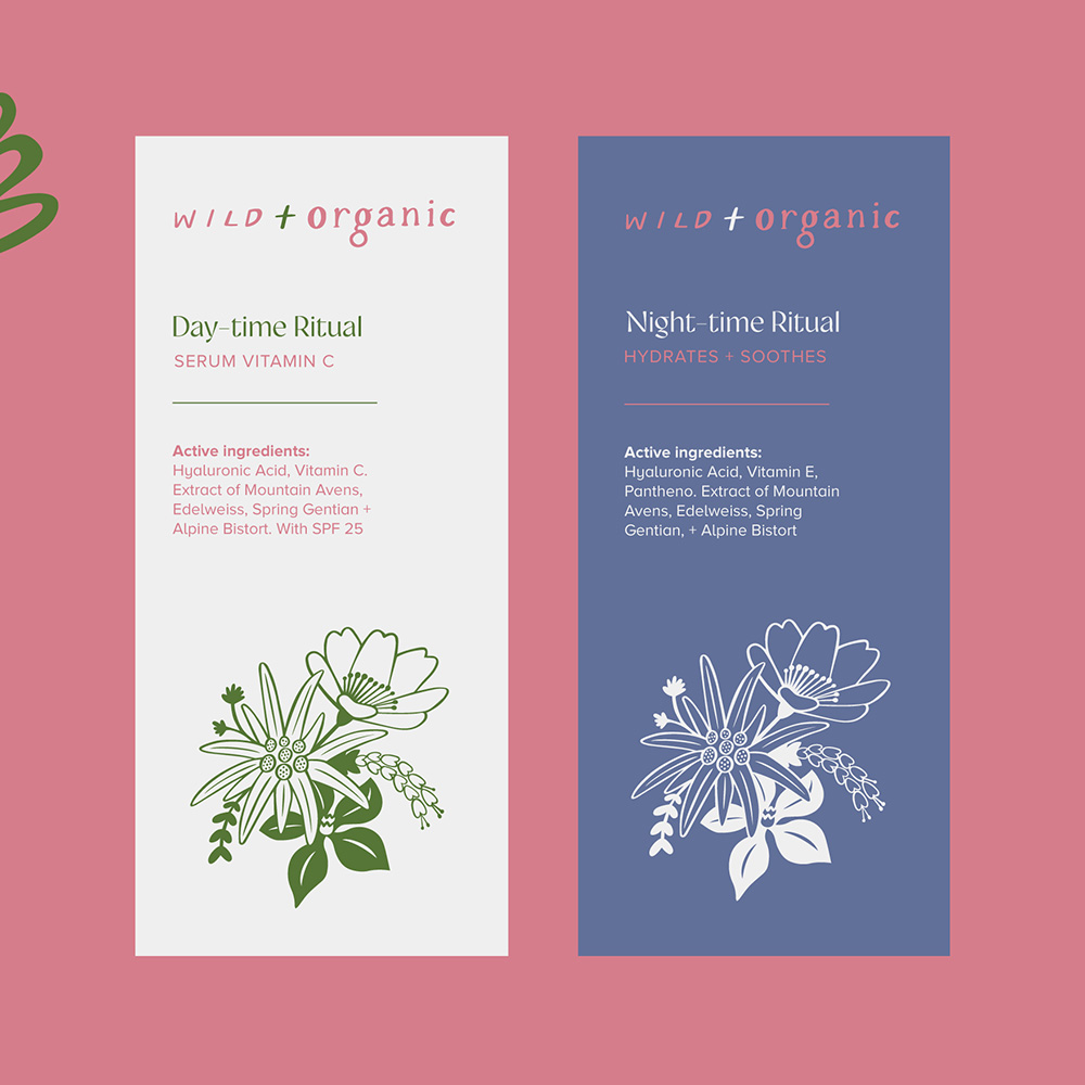
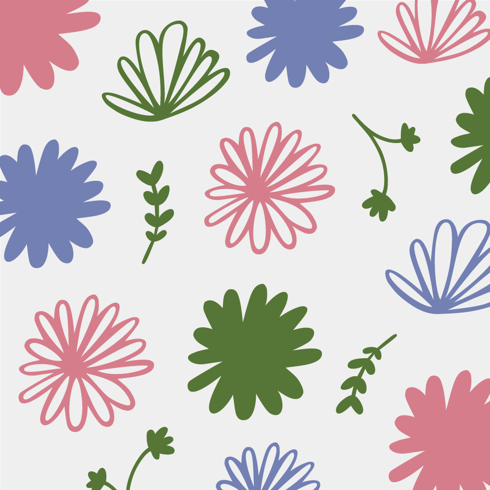
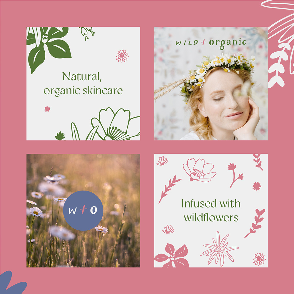
Logo & branding, illustration, brand patterns, socials, packaging design
Keywords
Organic, Natural, Skincare, Authentic, Wild, Botanical, Pure
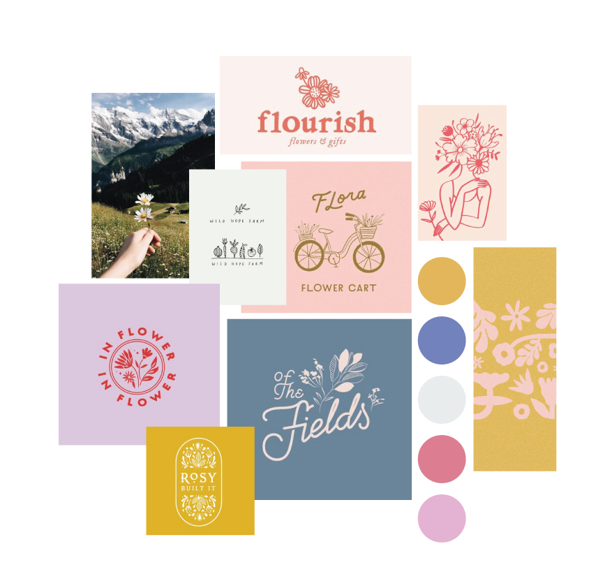
Mood board and creative direction
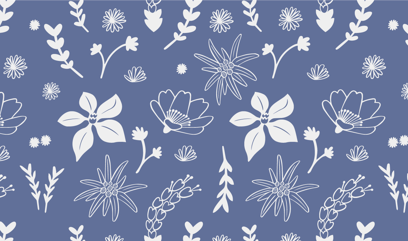
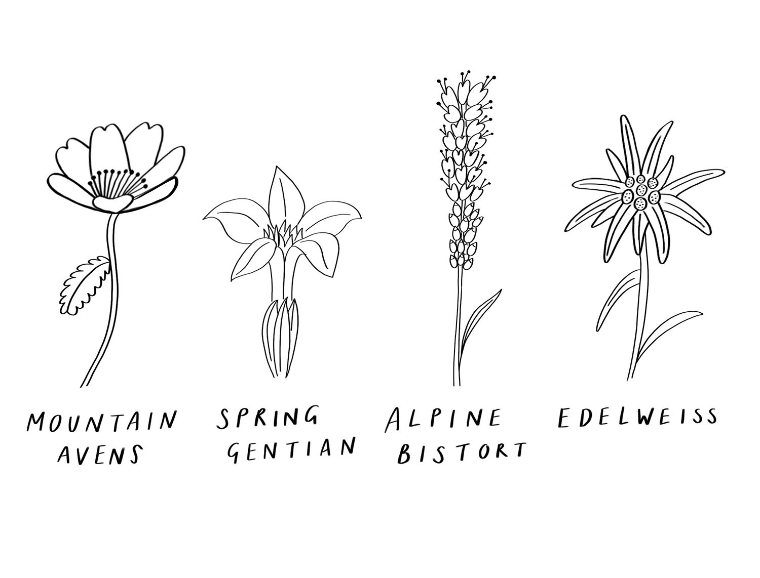
Because of the delicate nature of the Swiss Alpine flowers used within Wild and Organic products, I knew I wanted to create some intricate and delicate illustrations for this brand. I also wanted it to be completely hand-drawn, including the lettering, to reflect the natural ingredients of the products. I began by sketching the Swiss Alpine flowers that are included in the ingredients.
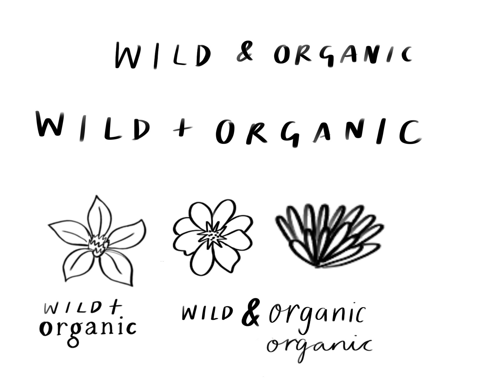
Primary logo and alternatives
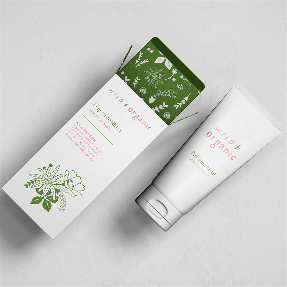
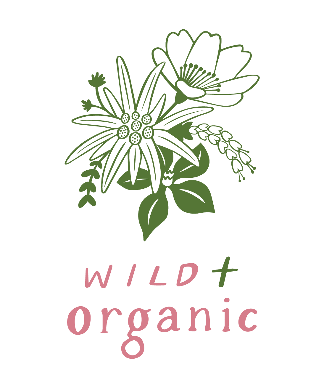
I created a delicate illustrative logo with hand-drawn typography to reflect the nature-inspired aesthetic of the brand. The hand-drawn elements also provide an organic and authentic feel, resonating with customers who value natural living. At the same time, they convey a sense of attention to detail, reflecting the care and precision that goes into formulating each skincare product. Hand-drawn typography and illustrations also achieve a unique and memorable brand identity which sets itself apart from other skincare brands.

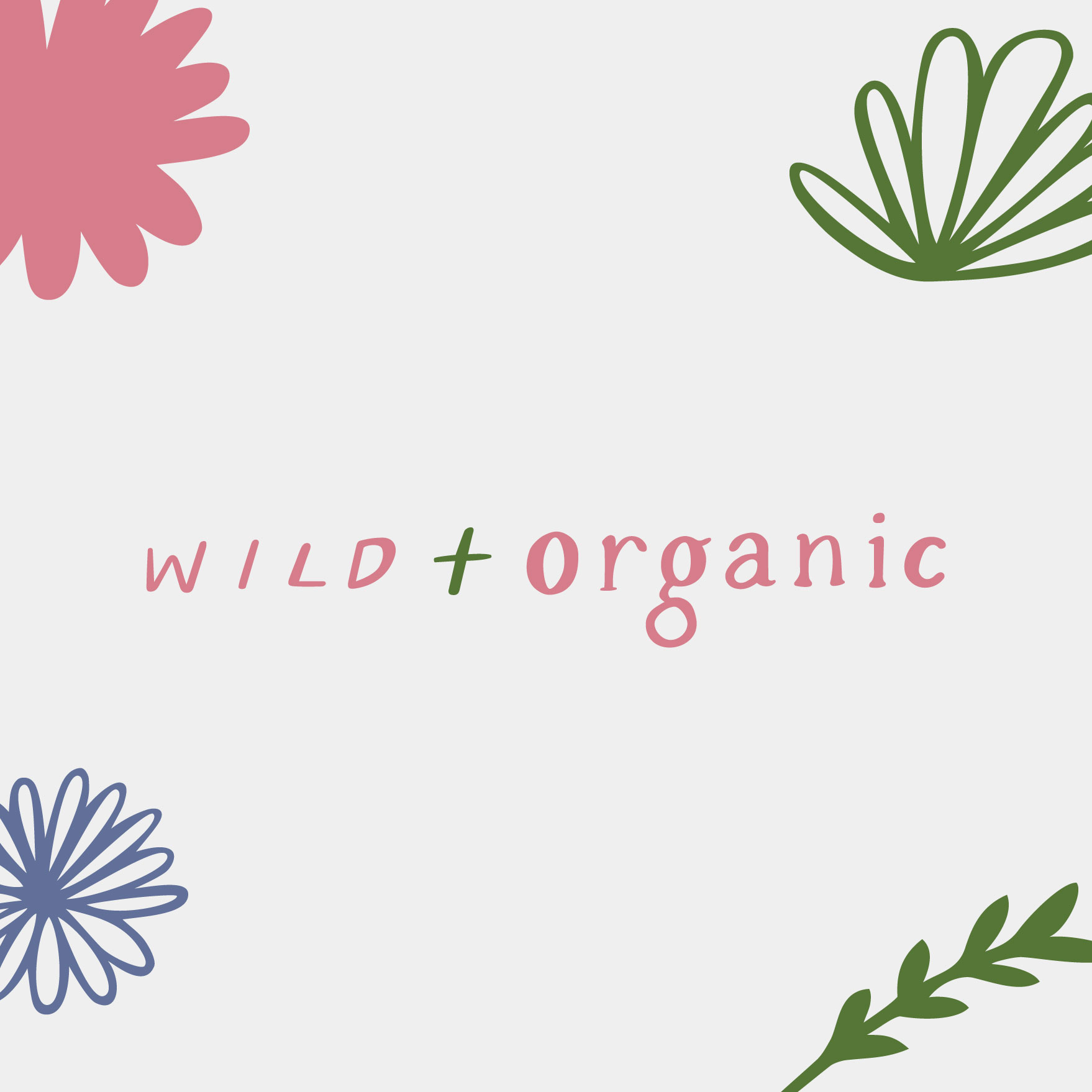


Colour palette
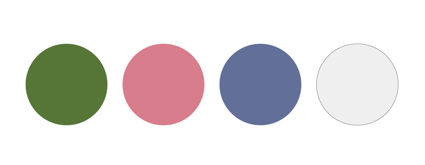
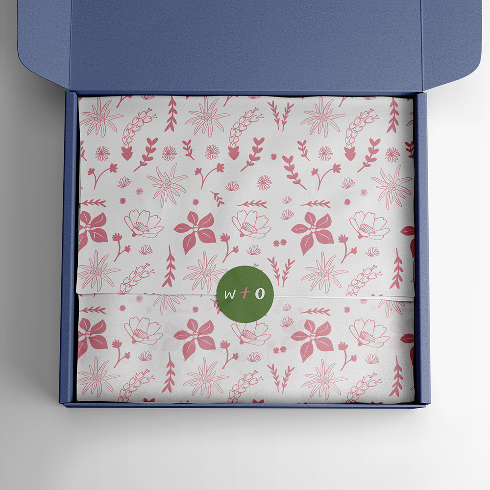
Each colour can be found in the wildflowers on the Swiss Alps. Green is associated with nature and growth, and the deep shade symbolisese the lush foliage of the wild and the grass meadows on the Swiss Alps. The earthy pink has been chosen to contrast against the green and conveys femininity, adding a touch of softness and balance. Lavender purple is associated with relaxation, tranquility and serenity, and is a traditional botanical ingredient known for its soothing properties. Each calming colour reflects the brands focus on wellness and self-care.
